The Art of VALORANT Map Environments
Hey everyone! I'm Lydia Zanotti, a 3D environment artist on VALORANT. With the release of Icebox, I thought it was the right time to bring you in from the cold and discuss how we bring our maps to life, from the inside out.
The VALORANT maps team is fairly small, and consists of level designers, 3D, concept, lighting, and QA. It's a real collaborative feat getting a map from greybox (the earliest playable version of a map) to a version that's ready for you, the player.
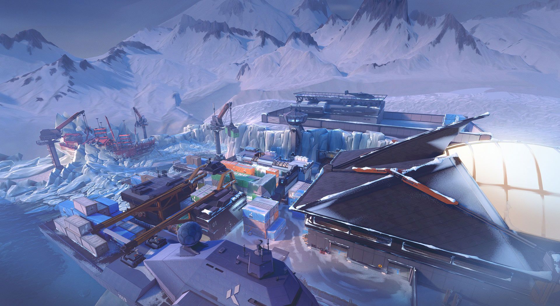
When it comes to maps, level design normally grabs most of the attention, and rightfully so, as designers spend months working on the greybox-playtesting and tweaking them until they are ready to hand off to the artists.
Today you're going to hear from the 3D artist perspective. That's me, the person who works on models, textures, sculpts, paint, shaders, and building the overall visual world. I hope to give you some insight into the challenges, successes, and misconceptions of crafting map environments.
If you want a closer look at how we approach level design, check out this story on the creation of Split.
AFTER LEVEL DESIGN
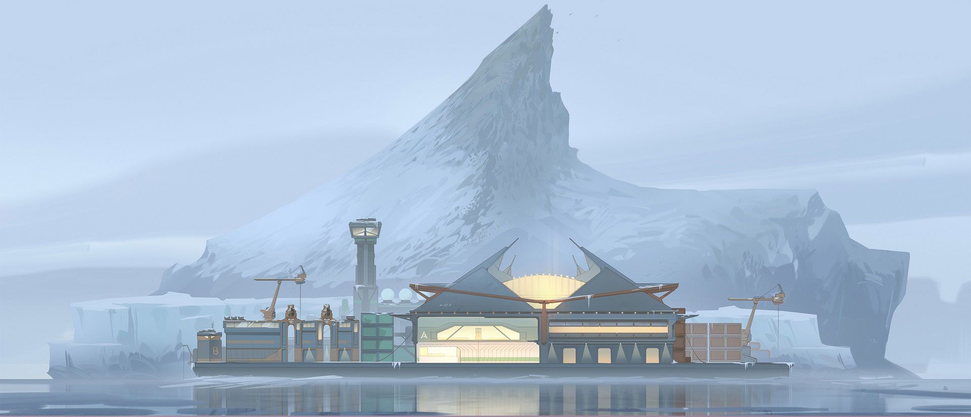
Before 3D artists can touch a map, our Art Lead and Creative Director work very high level with the concept artists to iterate on finding an iconic look for our maps using a series of blue-sky concepts. At this stage there's a lot of back and forth between the artist and project leadership to make sure the map follows the VALORANT narrative, is marked by visual variety, and most importantly, is something the team is really excited to be working on.
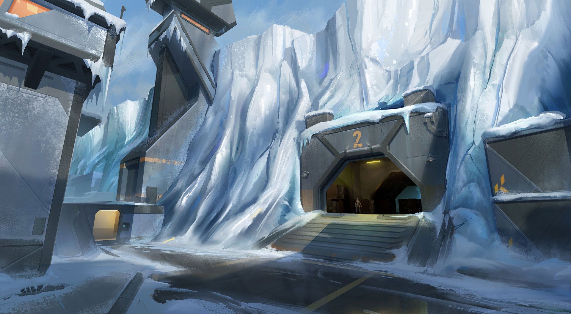
After a high-level direction has been locked down, concept artists begin to tackle specific locations and call-outs on the map based on the greybox layout. At this stage, the concept artists try to get as much coverage on the map before the 3D artists jump in and begin modeling the basic shapes of the architecture.
MAP FOUNDATIONS
Our map production pipeline can be broken down into several phases: greybox, art blockout, and art production.
Our maps are completely built using Unreal Engine 4, and the majority of the team uses Maya for 3D modeling (though a few of us use 3ds Max).
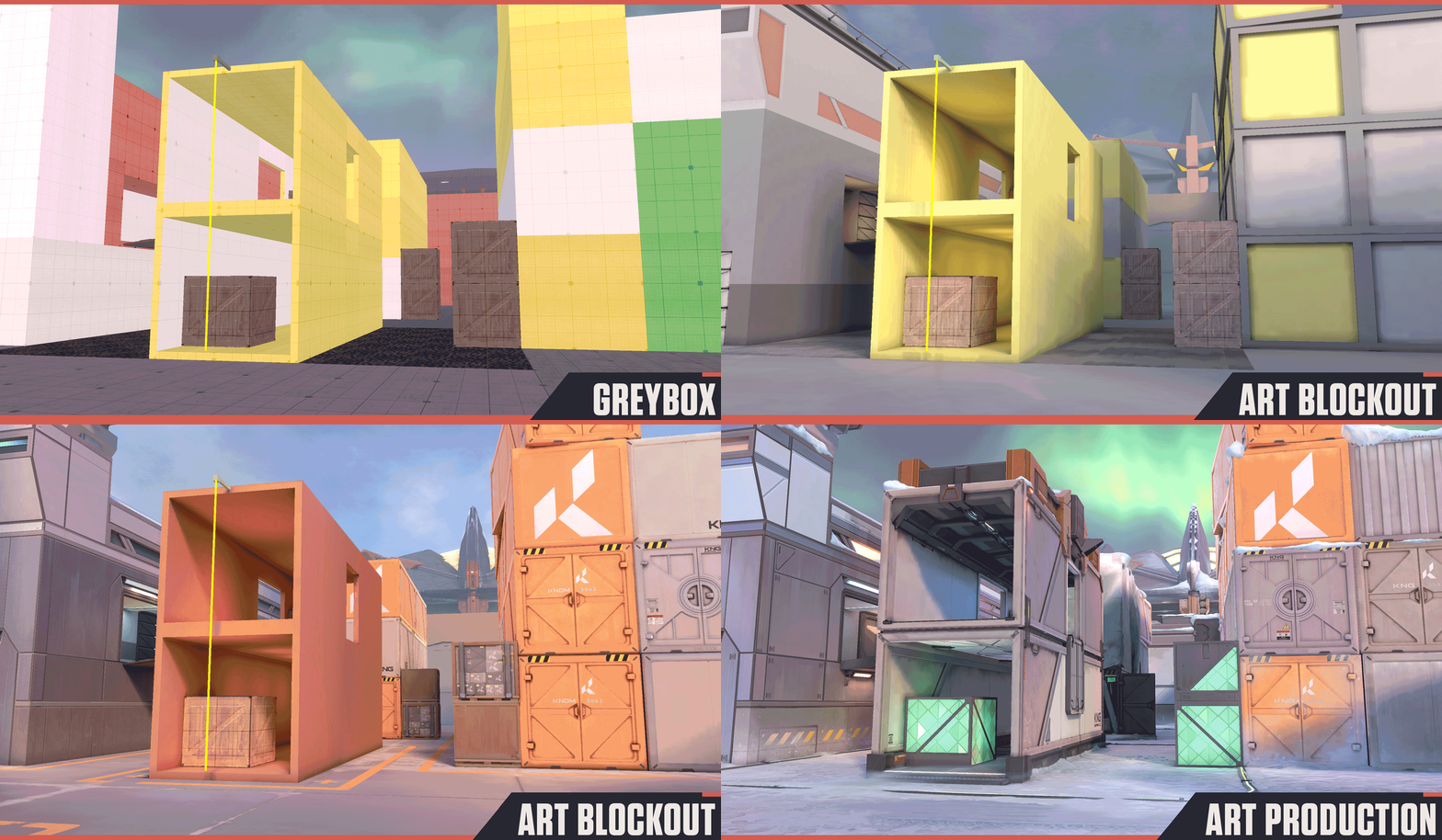
As we start to model the maps, we try to playtest them on a weekly basis to get a feel for the spaces, check for bugs, make sure there is accurate collision, and to spot areas that are too noisy or compete visually with our Agents.
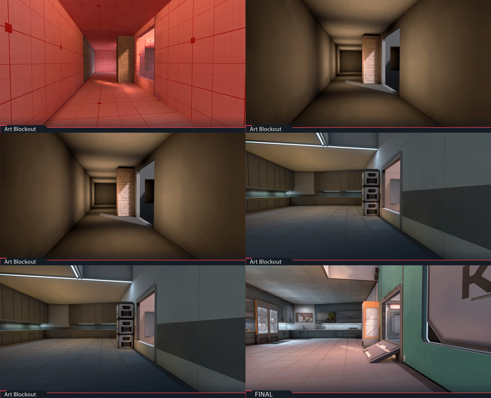
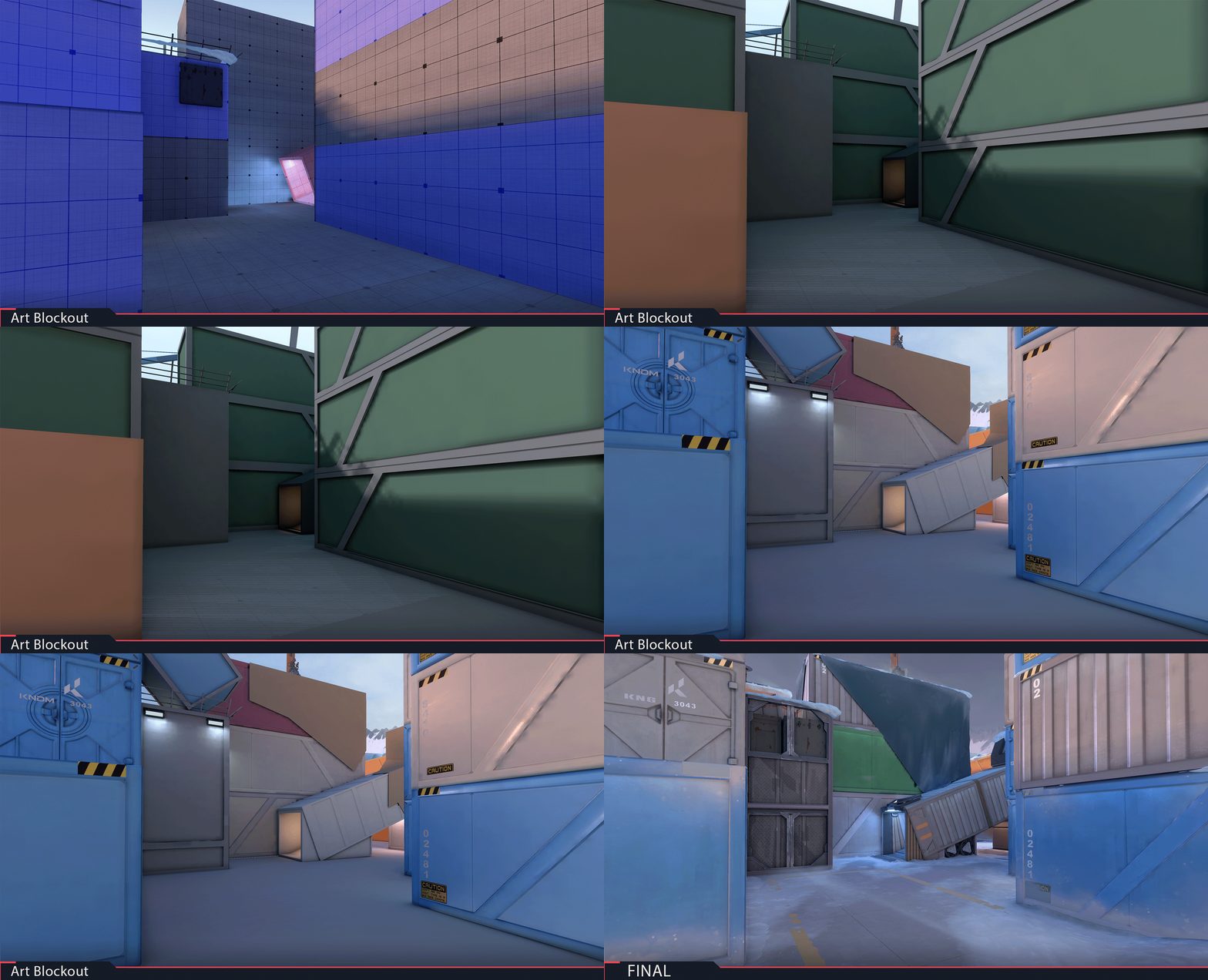
The level designers can make changes to the spaces as we're modeling them, and we have to pivot to those changes when necessary. This often happens during the art blockout and early stages of building the maps. Since concepts and layouts can shift, it's better to work with simple shapes during the blockout phase to avoid having to re-do work.
Two good examples of this can be seen in the Icebox blockout phases of "kitchen" and "mid," where changes were made to give some spaces more breathing room.:
OUT OF BOUNDS
Our main goal on the maps team is to not only provide the player with a beautiful looking map, but to provide one that also runs well. We may start with ambitious concepts, but at some point we have to reasonably limit how creative we can get. This is due to either having to adhere to the greybox layout, or because of performance constraints.
Performance is super important in tactical shooters, and we spend a lot of time working with engineers when we finish a map to clean it up and have it running as smoothly as possible. There are many ways we do this and there are always trade-offs like having to sacrifice visual quality to get a small performance gain. Those small gains add up, and they matter.
Optimizing a map is simple, however, as we can gather data to see what textures are taking up the most memory in the map, or which areas of the map have too many draw calls (or amount of assets in view). To help with this, we can "instance" meshes-meaning that if there is a pile of the same 20 rocks, we can instance them together, so that the engine reads them as one mesh. This helps us immensely as we populate the maps with a ton of props.
CONSTRUCTION, MINUS THE HARD HATS
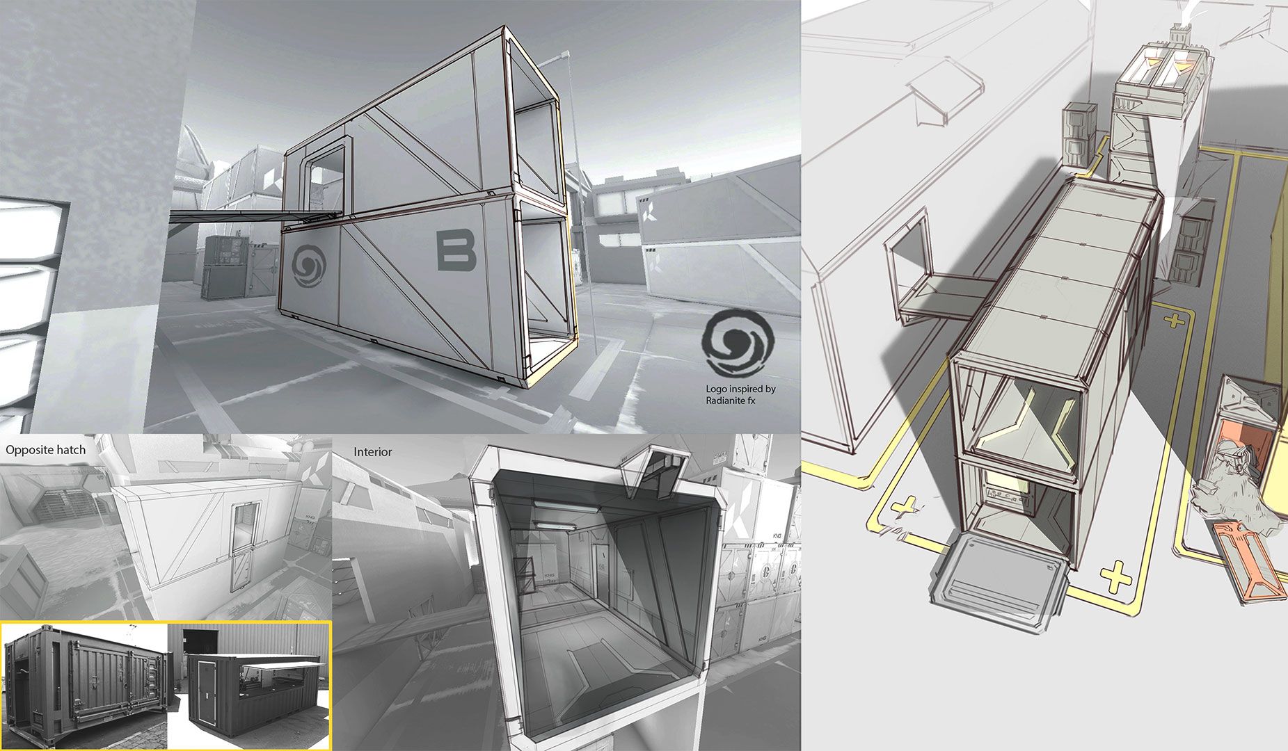
For some insight into my personal work on Icebox, most of my time was spent on the B-site half of the map. When I began work on the Spike plant area, I was provided several concepts to work from to get an idea and feel for what I'm about to create. While we don't have to stick to the concepts 100%, we do make sure that we stick to the greybox.
We often export the greybox meshes and then 3D model over them so that the walls and edges line up perfectly. This is especially important in areas with heavy gameplay (more on that later).
We try to model and get the basic architectural shapes into the map before starting to unwrap and texture them. When we start to add colors on the meshes, we make sure that they aren't too dark, especially in interior spaces. The objective here is to maintain gameplay integrity by making sure that the environment doesn't impede with clarity, and that the characters are always clearly visible.
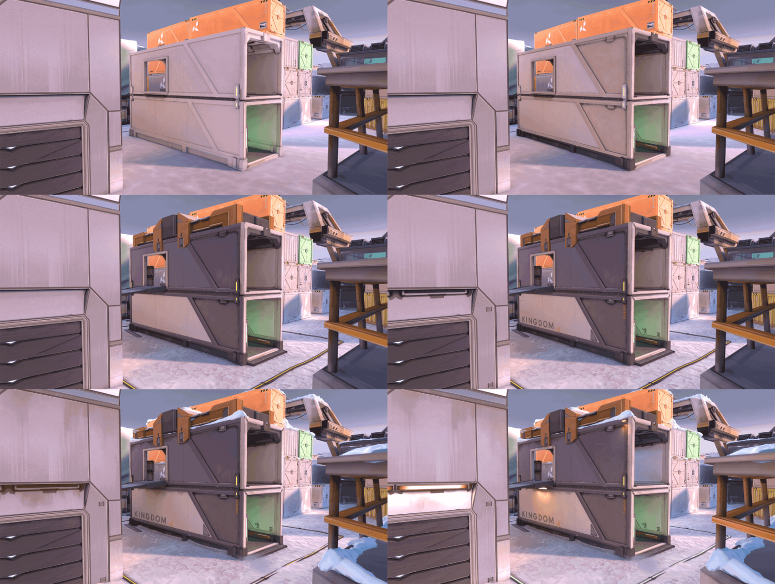
As far as texturing goes, we primarily use tiling textures and trim sheets on our buildings and large structures. These are created using a variety of programs such as Zbrush, Substance Designer, Substance Painter, and Photoshop. We do use custom textures on props when needed, such as the coffee machine in the kitchen, or the forklift near A-site.
MORE ON MAP CLARITY
Again, while our artist goals are to carry out the look and feel of a map, it is always subordinate to gameplay clarity and making sure the Agents are always clearly visible when they should be.
To help with visual noise, we make sure that our materials are similar in value and there isn't too much contrast or darkness. We can also improve clarity by using lights to illuminate dark areas, or to spotlight spaces where you would want the most visibility possible, such as a Spike plant site or a commonly peeked corner.
MAP MOTIFS
The sky's the limit on the maps we make -- for the most part. Adding graffiti, props, and small details to the map is how we tell a story to the players. When it comes to details, we try to keep the majority of it above player height so that the angles and peeks are simple and clear. We also consider designing areas in a way where it can actually help to guide your crosshair placement.
For theming and call-outs on the maps, it’s best to come up with ones that are simple and easily understood to avoid the pain of hearing your teammates scream “over there!” when really they mean “garage” or “market.”
We also consider callouts that are quick and easy to say while in the heat of a match. Some of our callouts are very obvious, such as “kitchen.” In other cases, we try to use colors as a way to help distinguish certain areas and structures, like the yellow shipping container on B-site.
Fun with storytelling and worldbuilding is probably the best part about being an environment artist. Each artist working on the map gets to add their own flavor to their sections of the ma—and sometimes even secretly sneak in a Tacti-bear somewhere. We use our best judgement and follow concepts where provided, but if we have cool ideas or something inspires us, we let that creative energy out into the maps.
One way we add more visual interest and story into the maps while sticking to greybox is to build outside of the gameplay space. An example of this would be the Bunker built into the glacier wall on B-site. Inside, I created an interesting storage space with a curving tunnel, without having to worry about gameplay since the player can’t go into this area anyway.
UNDER YOUR FEET
There really is no “final” phase of a map because we’re always depending on your feedback for ways to improve our five maps, on both the art and design side of things.So, keep it going!
Reddit, Twitter, Discord—you name it, we’re on there.
Enjoy the cold, and hang tight while we work on the next stomping ground.