Astra: From Sketch to Key Art
Hi, I’m Suke, Principal Illustrator on VALORANT. We’d thought it would be fun to show you a little of what goes into the VALORANT illustration process, our style, and how we tell the story of Astra through art.
But first, watch this!
As part of Episode 2 Act 2, we just added Astra, our newest VALORANT Agent. Like gameplay, it’s not enough just to have something new. Each Agent illustration should really stand on its own while maintaining a style and coherence with the rest of the VALORANT world.
Every Agent illustration starts with a “thumbnail” as shown above.
Thumbnails are quick and simple. We use them so we can explore multiple options without committing, making the whole process time effective, since we can’t go back once we move on to the next steps.
During this process, we keep in mind who the character is, what their attitude and personality are like, if they have distinct features, e.g. a gauntlet. We strive to emphasize what is most important for the character so you can understand them at a glance.
One thing that is always important is focusing on keeping the shapes really cool and exciting. It’s more about that, and less about rendering them realistically—and it’s a pretty tough balance to manage!
VALORANT “KEY ART”
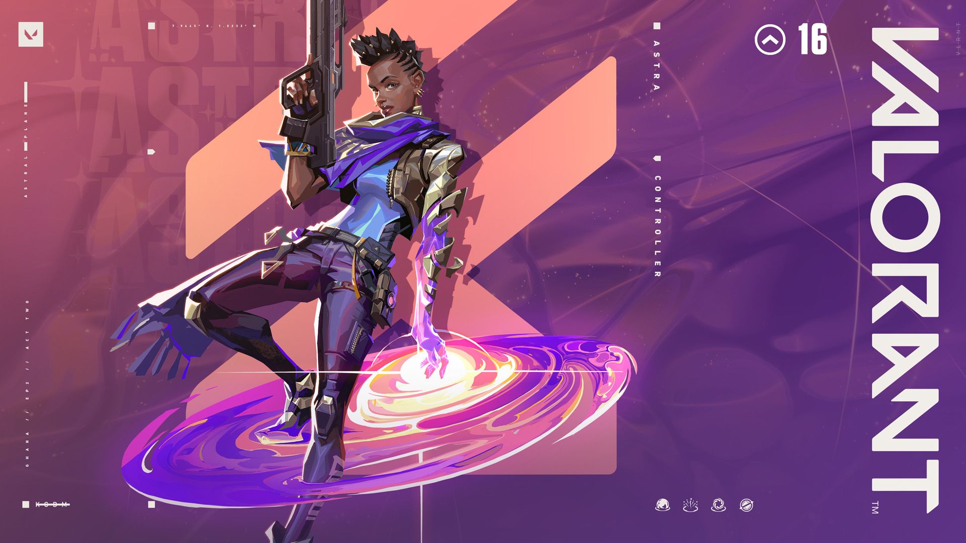
When it comes to what we consider our VALORANT “key art” (the image you see everywhere to promote new stuff), the process begins with thinking from your perspective: what feeling do we want to give you and what do you want to experience?
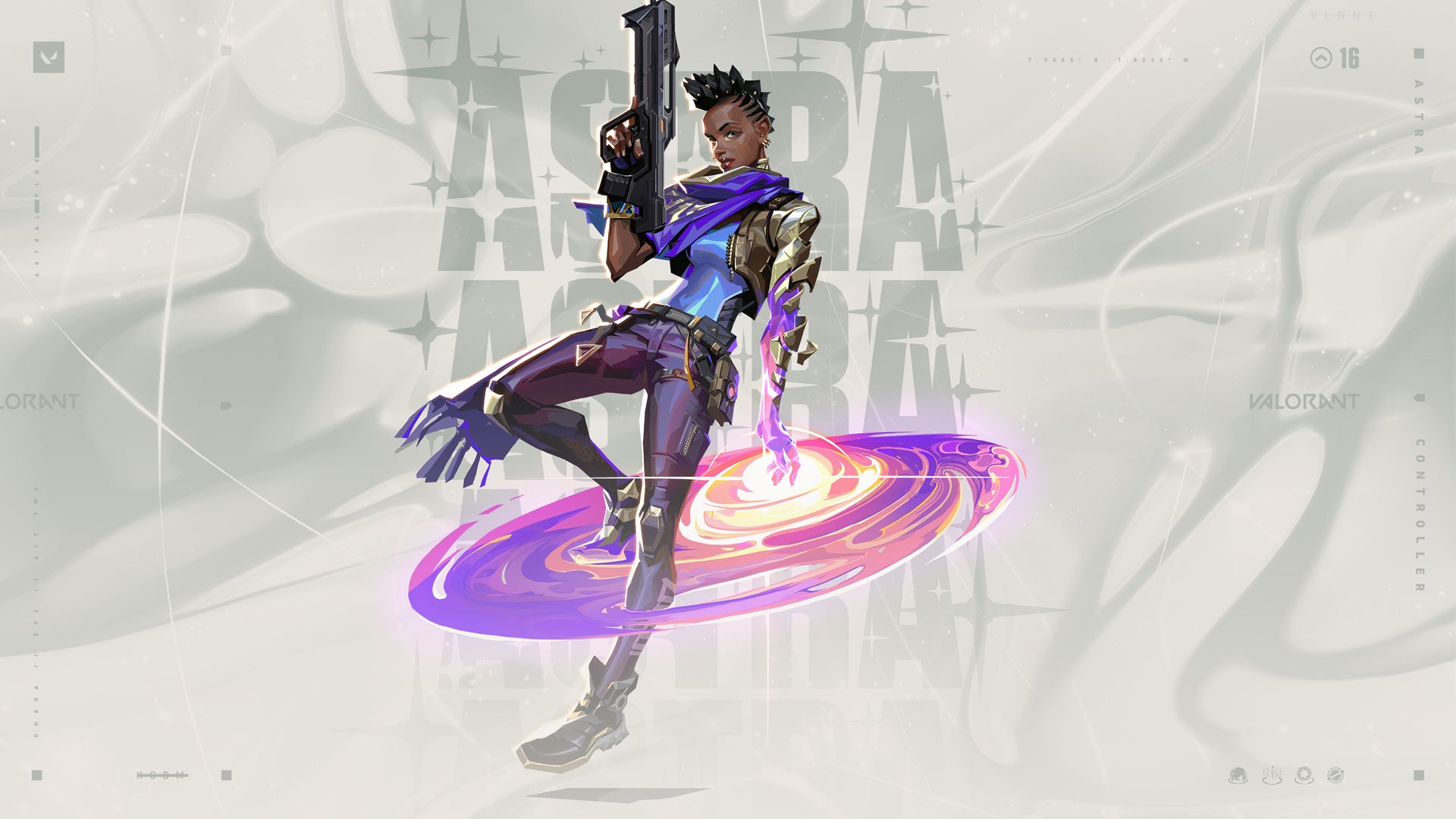
For Astra, we wanted to show her Controller role in some way. From a character perspective, she is an Agent defined by her source of power. She also has a youthful intensity and playful personality.
So, how do we visually represent these vibes through composition and pose? It starts with a couple of rough sketches, where we pick the direction she’s floating in the air, and give a subtle understanding of her role. This way, the viewer (you) understands that her power is related to the sky.
In the second round, we picked a version of the sketch where her body is slightly tilted. We wanted to give you an idea of how she gains control while also showing hints of that playful personality. As you can see in the video above, it got pushed even further in the next phase, when I angle her face toward the “camera” with a very subtle smirk.
A very fun part of her design is mixing her aura of power with an African Futurism element. I really enjoyed playing with the golden arm effects, especially when the lower arm pieces start to float and her “true” form is revealed.
She also has a really powerful ultimate in-game that we are definitely excited about. Even though we couldn’t show all of her abilities in one piece, we can still display her power casting in a really vibrant way.
After all, when everything comes together, she comes alive. The progress from thumbnail to finish even caught me by surprise! Hope you guys like it too!

