Controlled Ruptures - Making VALORANT’s Fracture
Hi, I’m Joe Lansford, one of the level designers on VALORANT. Now that Fracture has entered the fray, the maps team wanted to take a moment to talk about its creation.
As a refresher, our maps design philosophy since day one on VALORANT is to push each map in a specific direction, instead of trying to accommodate ideal situations for each of the wild number of permutations that our weapons and abilities create. We build each map with a different hook that presents unique scenarios for you to problem solve.
We proposed the same challenge with Fracture and today Brian Yam, one of the lead artists on the maps team, will join me to break it down for you.
EARLY FISSURES - THE DESIGN QUESTION
You may have read by now that we started with the question, “what if attackers could pinch defenders from both sides of the map?” This exploration led to the “H-Shape” layout, ziplines, the four orbs, quadrants, and just about everything else that makes Fracture what it is.
With the novel strategic layer, we didn’t want to do anything too far out there for the moment-to-moment gunplay though, so hopefully you’ve found all that feeling fairly familiar.
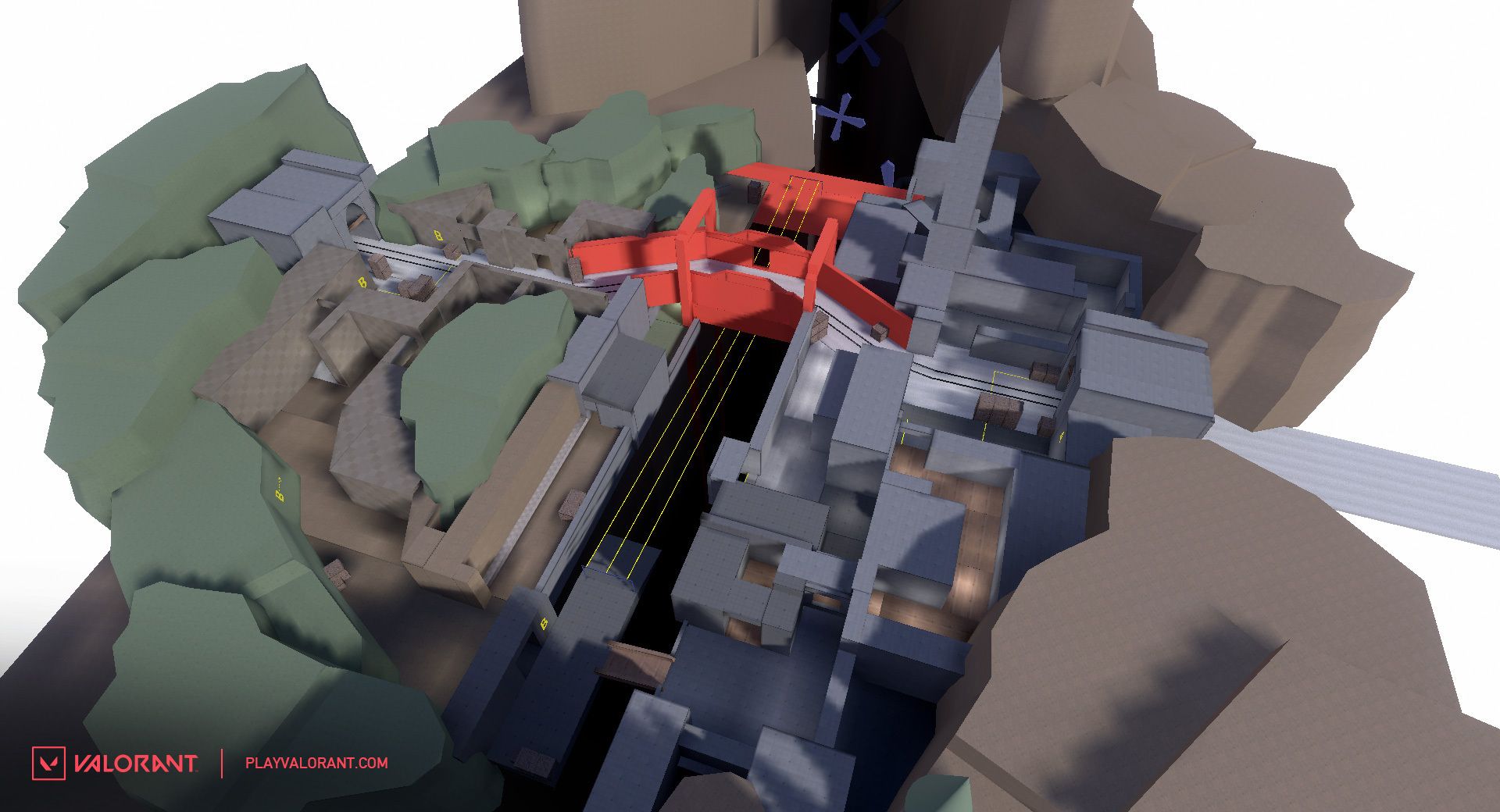
It took us a while to get there though. We weren’t really sure what the H-shape was going to do and it required a lengthy iteration period to really lock it down. Here’s what the original looked like:
In this iteration, defenders only had a single rotation path through their spawn. There’s a very complex approach here through A Halls/Door area with an under-over (drop into A was also on this side), sites are completely different, there’s a path alongside ziplines, a wider map, etc. Lots of differences—I think the tunnel under B is about the only thing that didn’t change!
But the “footprint” was there. The team was sold on the core promise of the map, enough to work through the problems.
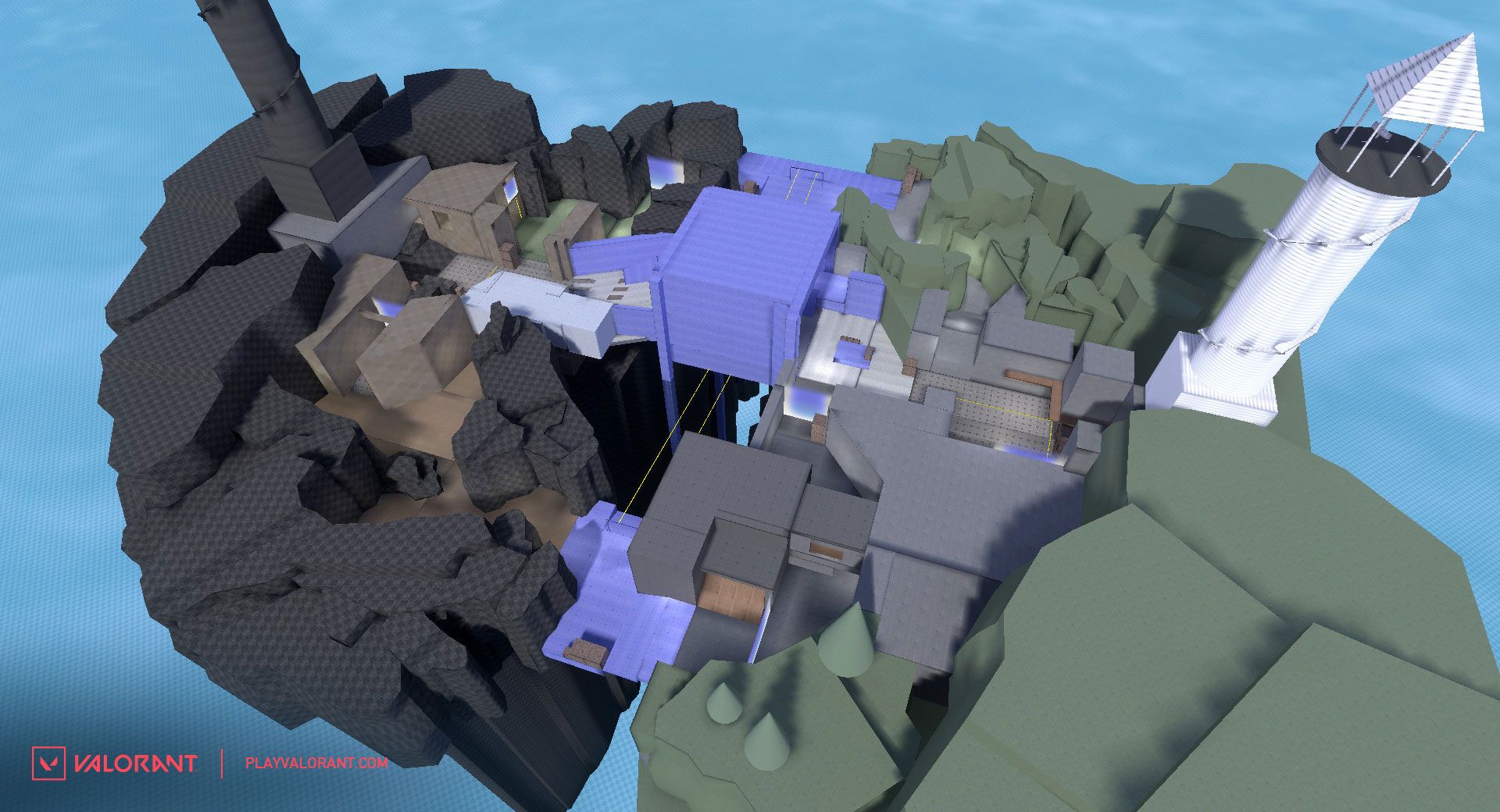
This led us to our next big breakthrough: a safer rotation for defenders through their spawn (it seems so simple in hindsight). This was critical for giving defenders more options in how they could set up and move. The previous version often ended in situations where post-plant attackers would have enough utility left to completely choke out defenders in their spawn.
In the above image, you can see the defender structure start to take shape as well as both the sites looking much closer to what we have today. Not to mention some stand-in thematic development even as early as the greybox phase.
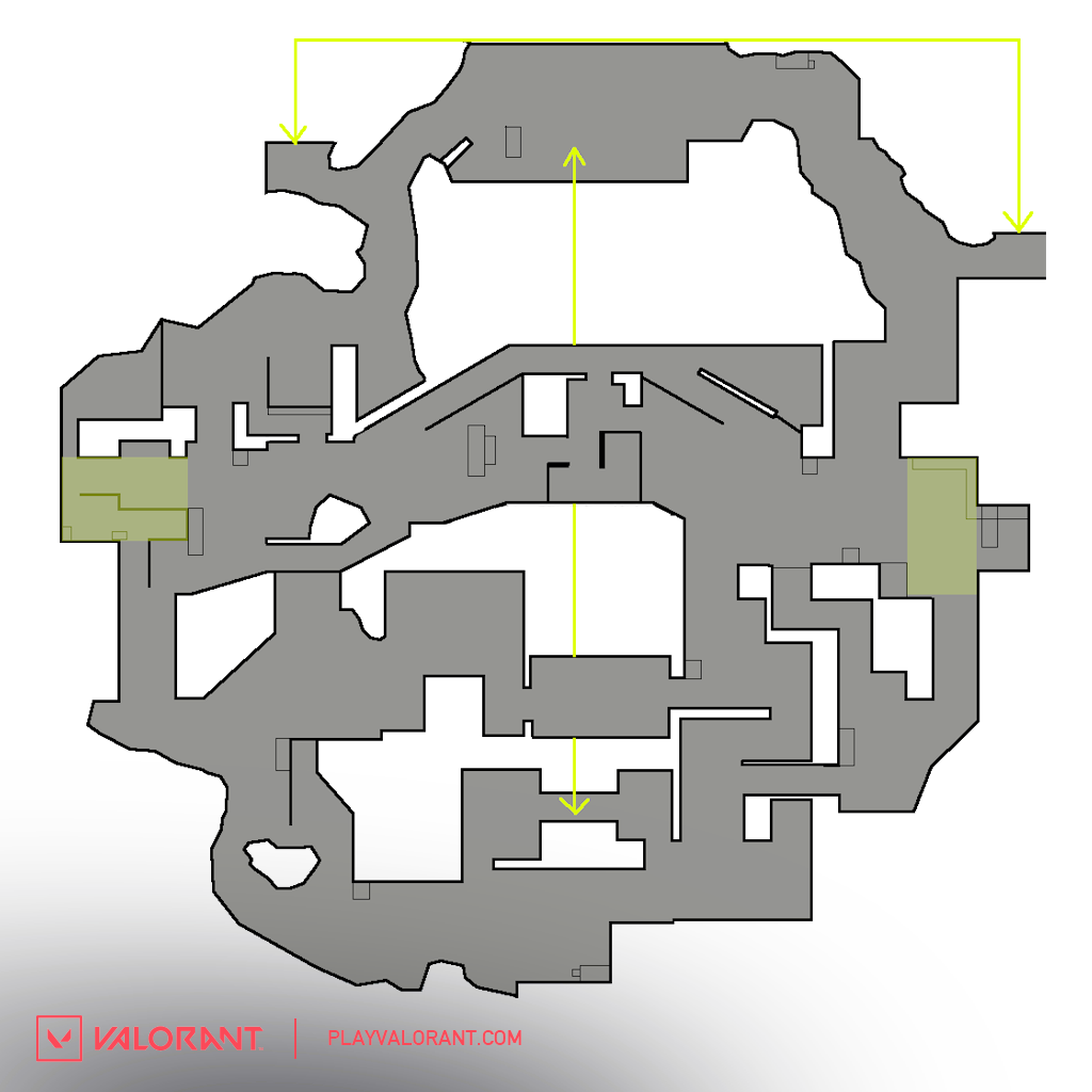
At one point, we tried an additional set of ziplines (as seen in the below mini map image) linking Arcade and Dish areas as well as a second bridge cutting across the middle of the map for attackers.
Once the defender area got sorted, the next big task to take on were all the neutral spaces. As you can see in the minimap above, these areas were quite different.
With the next few iterations, we wanted to make these areas a little more paced and desirable for defenders to take and hold—giving them an option to either push through and flank, or use as a retake position.
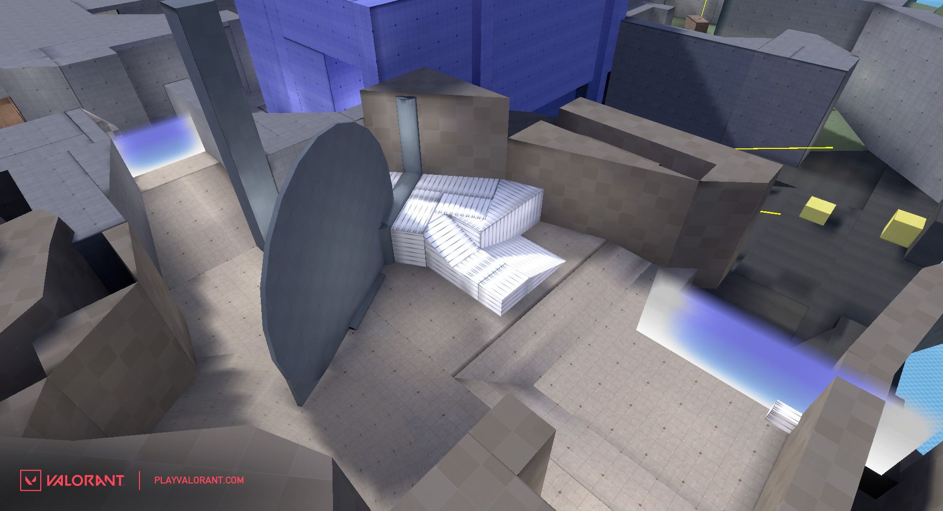
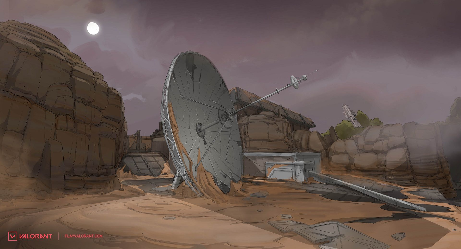
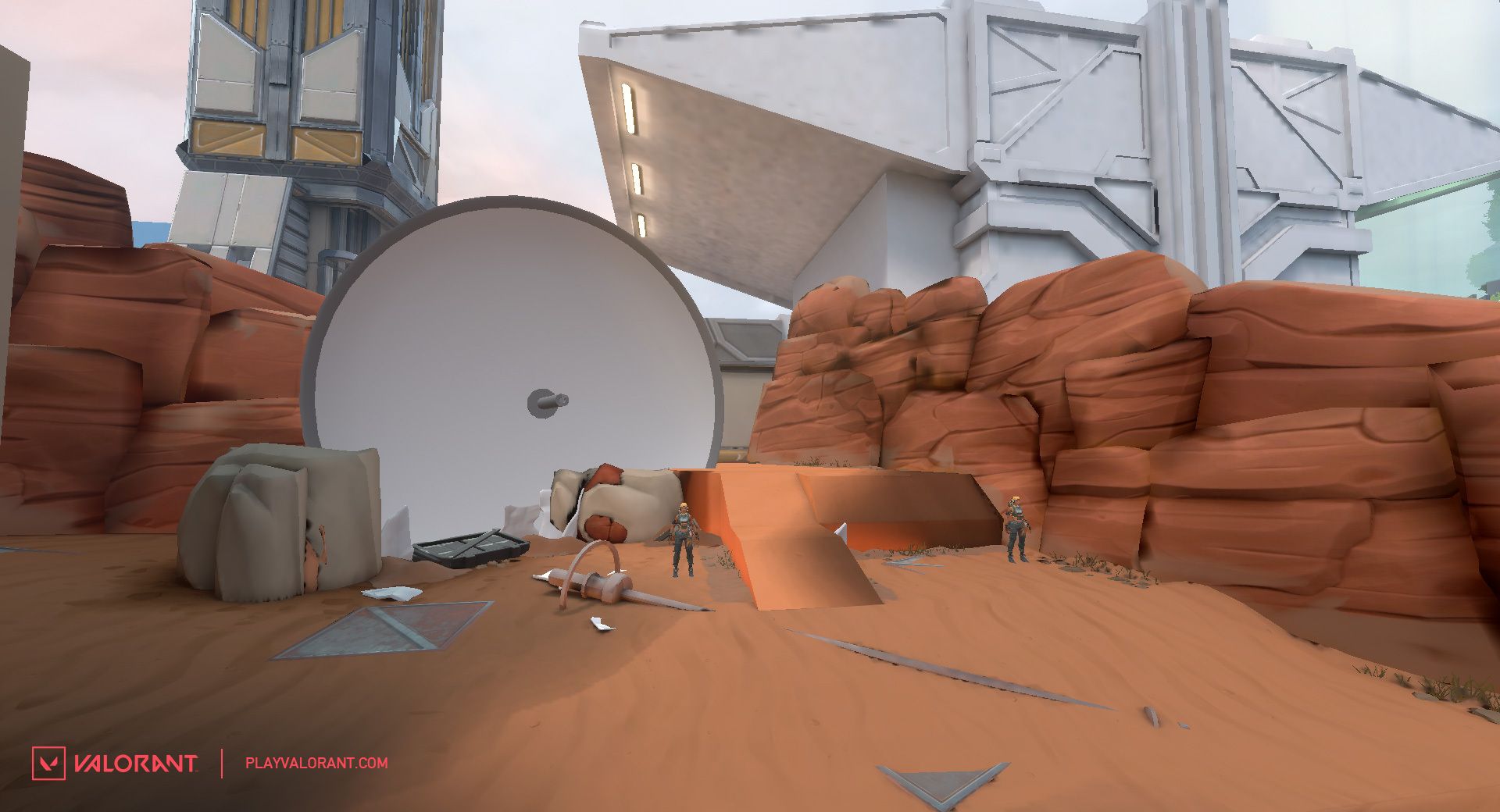
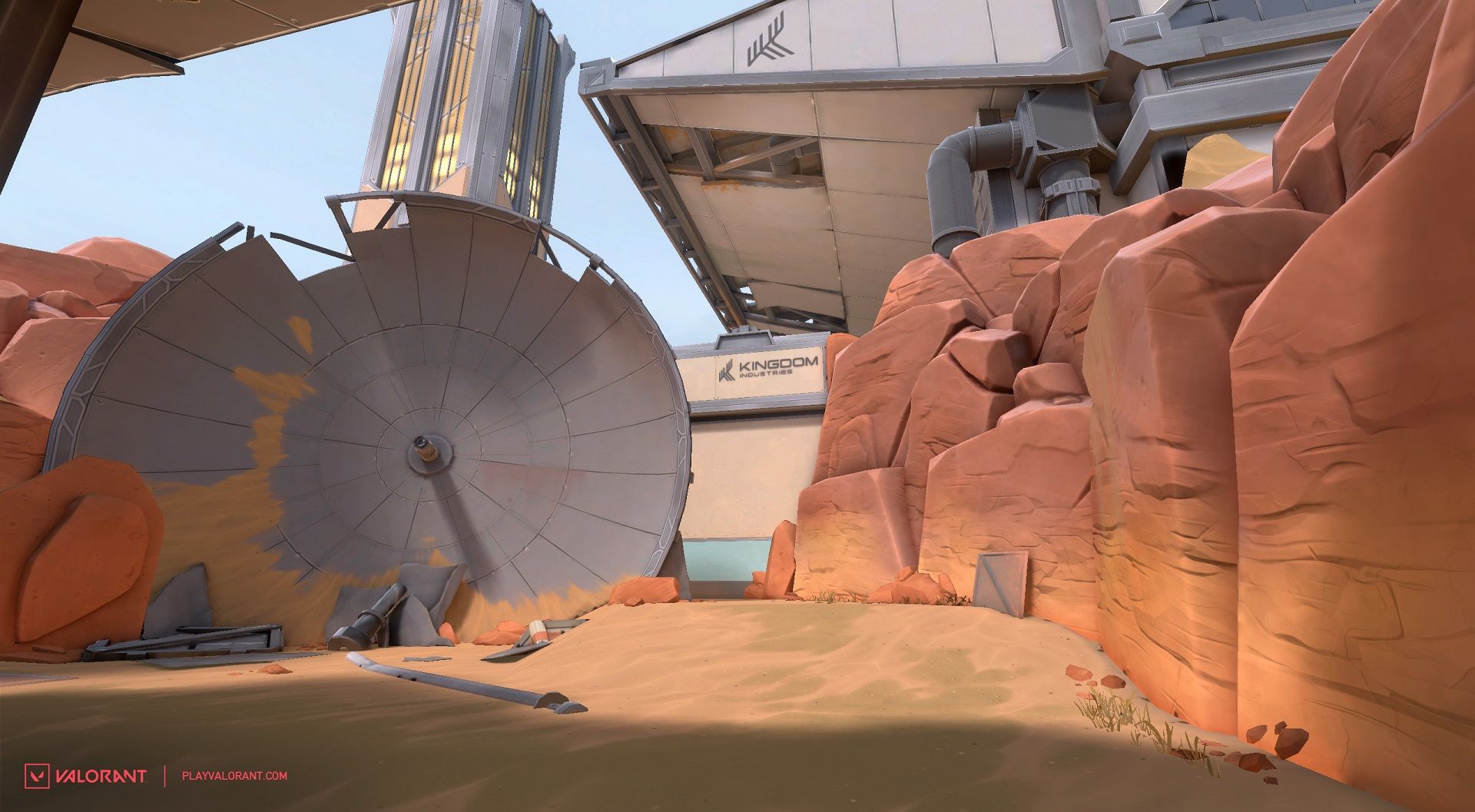
One of those areas, the Dish, was actually an idea that came from some concept references I was looking at after we decided on the desert direction for A side. A radar dish broken down in the desert was such a striking image, I felt I had to try to make the gameplay work (it was originally a good bit more complex and open).
After that, it was just lots of fine tuning.
For the visual theme, the team had a bunch of great ideas (one of our favorite parts of the map creation process is pitching visual themes), that I’m going to keep secret in case we use them in the future. But we were pretty excited about the idea of the dual biomes and it presented a great storytelling opportunity.
There are two factions working together in secret. Something goes wrong and the world is ripped apart. The visuals and gameplay both came together to deepen the world of VALORANT. (And our first in-game narrative content!)
WHAT HAPPENED HERE? - THE DESIGN QUESTION
Hello, this is Brian Yam, and I’m one of the art leads on the maps team. Now that you’ve read Joe on the design side (and spent some time playing Fracture), I’ll guide you on the visual development of Fracture in a similar way.
When Fracture’s theme was first conceived during the pitch phase, we wanted to push the idea that this map was visually split from it’s lore aspect, but also from a visual perspective. Since most of you generally identify a map through art visuals, the concept team wanted to capitalize on this.
For art the big question was this: “How can we create a visually compelling map that prompts players to question what happened here? What caused the split on both sides?” This was also an opportunity to help hint at the presence of Kingdom Omega into the narrative.
VISUAL DEVELOPMENT
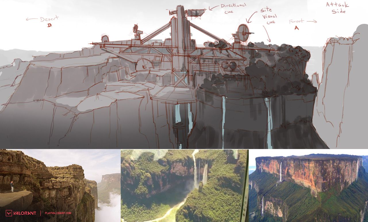
Below is a very early sketch of the overall map from the greybox. In the initial concepts, our goal was to establish a visual direction of what this place is and why it exists in this space.
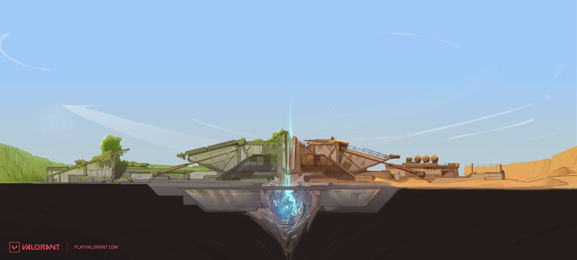
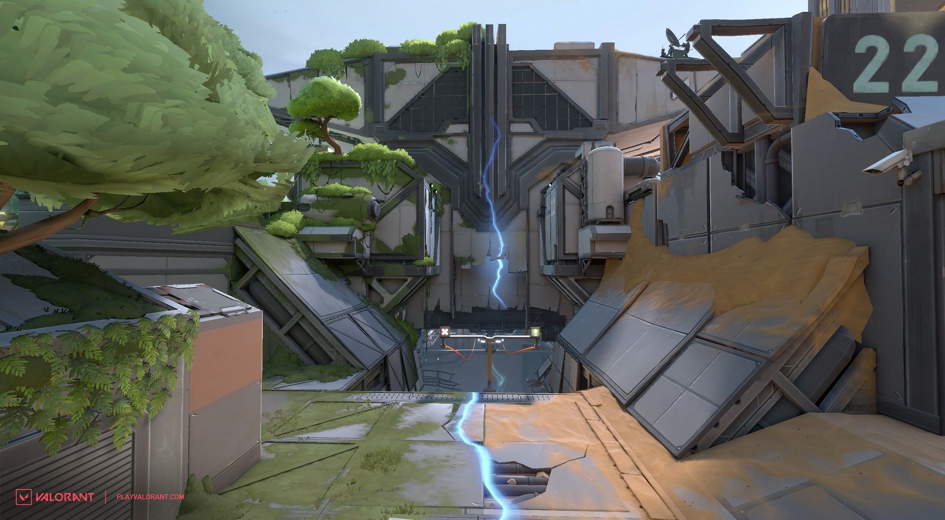
A compelling idea to us was to have a science facility sit atop of a canyon, partially hidden. To address the visual lore, we established two extreme contrasts that resulted from an experiment gone wrong. We went with a desert biome for Omega Sector and overgrown foliage with Alpha Sector, with the rift dividing both sides.
Artistically, this created a visual contrast in color palette of warm versus cool, and desertification against forestation. We thought you would also appreciate this contrast for callouts and memorizing each side distinctively.
One of the most important concepts we typically establish early on at the end of “blue sky” development (where anything goes) is to create what we call a dollhouse. The next image is of a dollhouse for Fracture created by our senior concept artist, Theo Aretos. This high level concept helped establish the shape language, color palette, and general direction of the mood we wanted.
From there, the concept team starts to focus on more specific concepts within the greybox locations. The art team works closely with level designers to iterate on specific concepts within those locations.
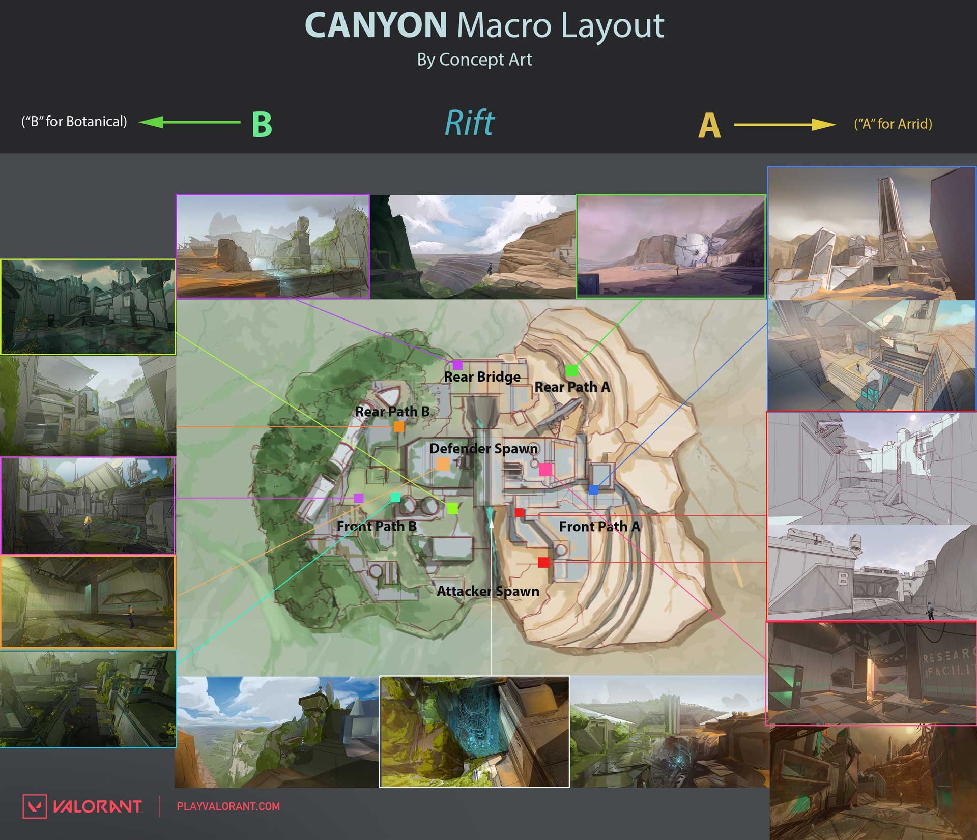
At this point we also want to get a clear concept of how the layout of the map will be from a top down view, which shows the overview of the map along with callouts noted with rough thumbnail concepts of where key locations are.
In the example below, this type of information was helpful for an initial art block out where 3D artists build a more refined 3D blockout over the level design greybox to reflect compositional and silhouette shapes inspired by our concept art .
Key Concepts
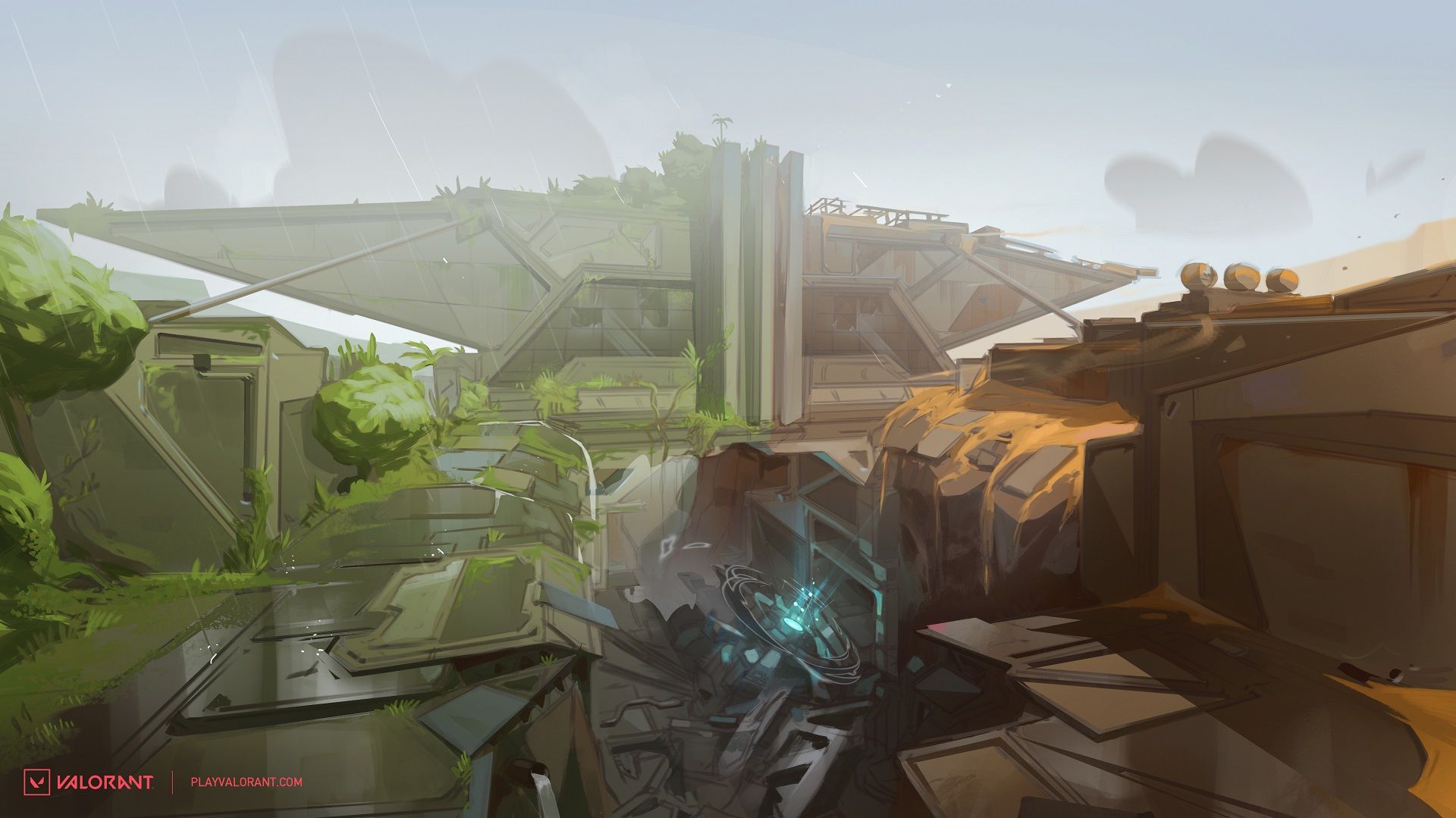
The following images are some of the key concepts that helped drive the artistic direction of the visual target for Fracture. These images are the final version of a concept for two areas (hopefully you recognize them) that provided a general direction for our 3D artists to hit.
Concept to Art Blockout
For some background, the concept team initially completes the first stage concepts prior to initial “art blockout”. Typically, we establish roughly 70-75% completion of concepts in each area that are adequate for art blockout.
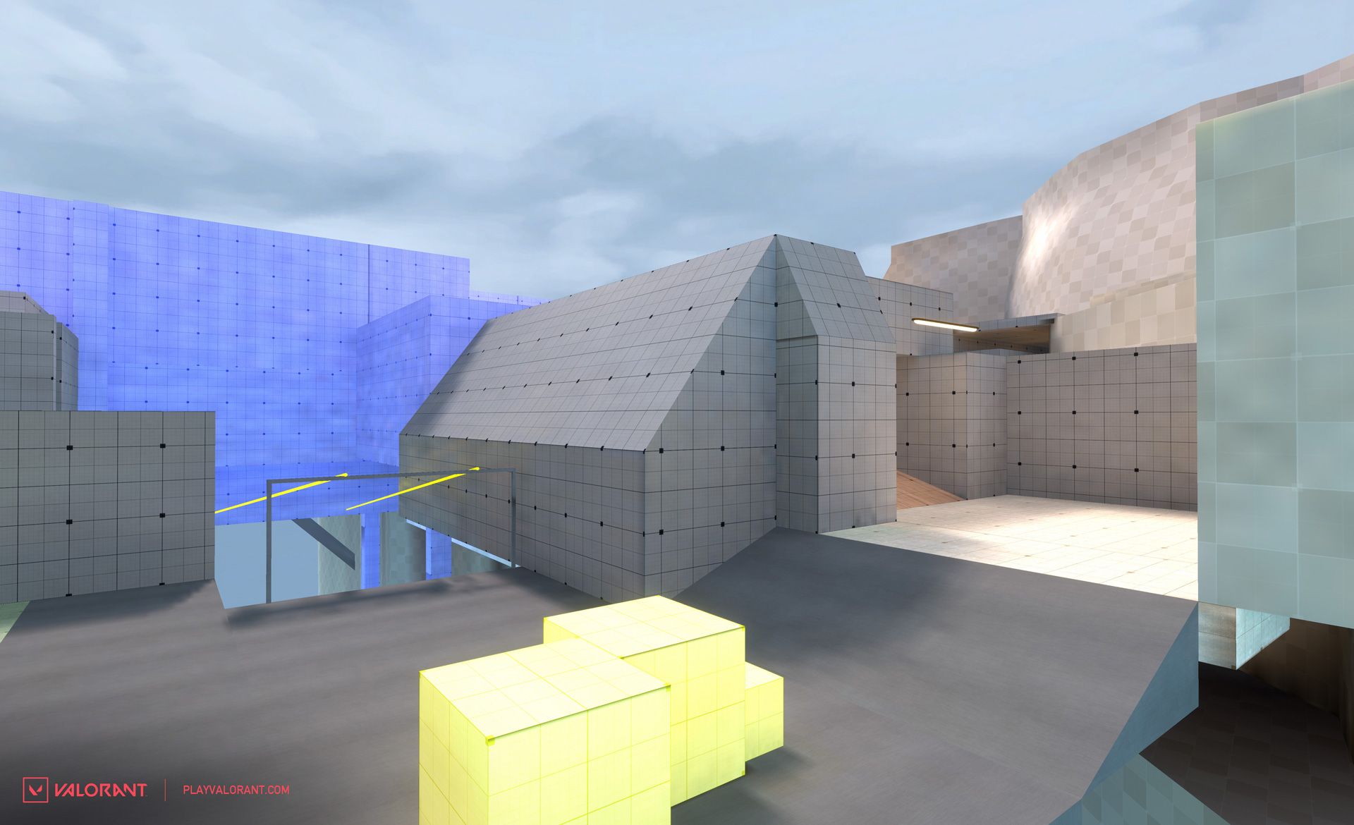
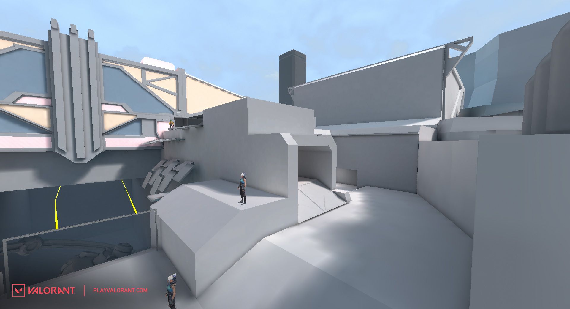
Art blockout is where we start building a rough 3D shell which represents the shapes of the architecture, landscape, and environment composition from the concept art which is tied closely to greybox parameters. Here’s are some examples on Fracture—
Greybox design mesh:
Art blockout on attack spawn and dish:
A lot of collaboration between the design and art team happens here. The reason for this is because the level design is still undergoing changes after the art blockout is created, and many adjustments and tuning still needs to be done.
Art Production
This is the fun part! Now that we have all the nuances for gameplay and initial art block out pretty much locked down, this is where we go into production to finish up the final 3D art. The final art typically represents the concepts, but they can change along the way if we discover improvements.
It’s fun to watch players discover the lore and develop interpretations just through the art. In VALORANT tradition, how many tacti-bears can they find throughout this map?
And for the next map...here’s Joe again with the final word.
CHECK YOUR INBOX
It’s been really fun watching you solve the gameplay opportunities of Fracture. The meta is barely starting to form and everyone on the team is eager to see how it evolves over time.
As for what comes next on “map 8,” no spoilers, but you might find some clues in those Fracture emails. Hopefully they’re not lost in your spam folder.
