Deep Dive Into Icebox 4.04 Changes
Hello! I’m Joey Simas, one of the game designer’s on the Maps Team and I helped drive the Icebox design changes that shipped as part of Episode 4 Act II. If you just want the simple version, you can always check out Patch Notes 4.04.
This deep dive is an opportunity to let you in on some of the opportunities we saw and reasoning behind certain changes.
WHAT’S IN THE BOX?
Icebox is a map that pushes for more complexity and vertical gameplay, and we feel good about how the map has shaped up over time, including the Patch 1.14 updates. That said, we noticed some play patterns on B site that we didn’t love, along with your feedback about the site needing some changes led to the 4.04 tweaks.
We’re taking on that feedback by making some large changes to B site with several additional changes focused on overall quality of life improvements throughout Icebox. B SITE: APPROACH, CONTROL, DEFENSE
Let’s start with the attacker's approach to B site.
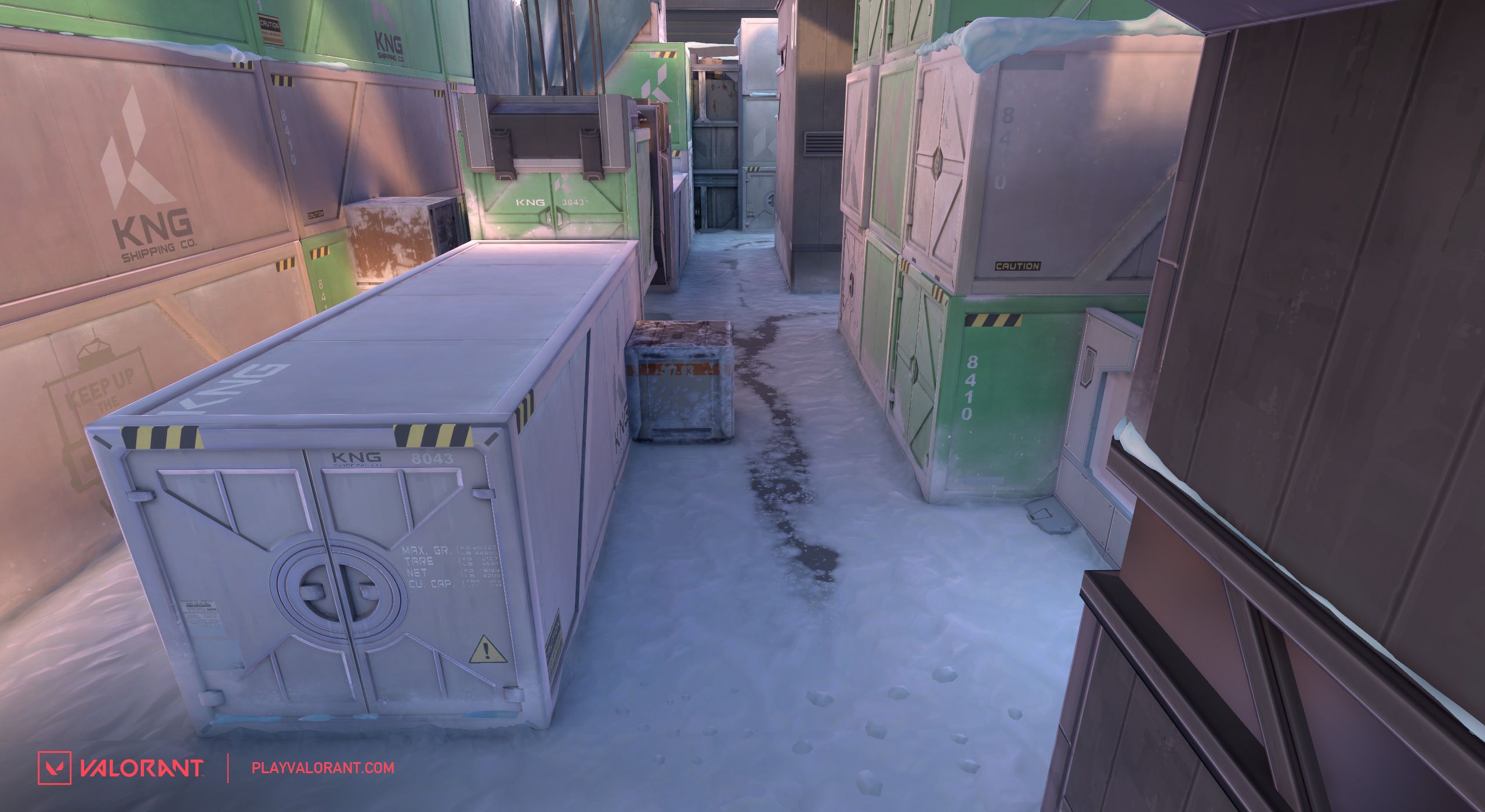
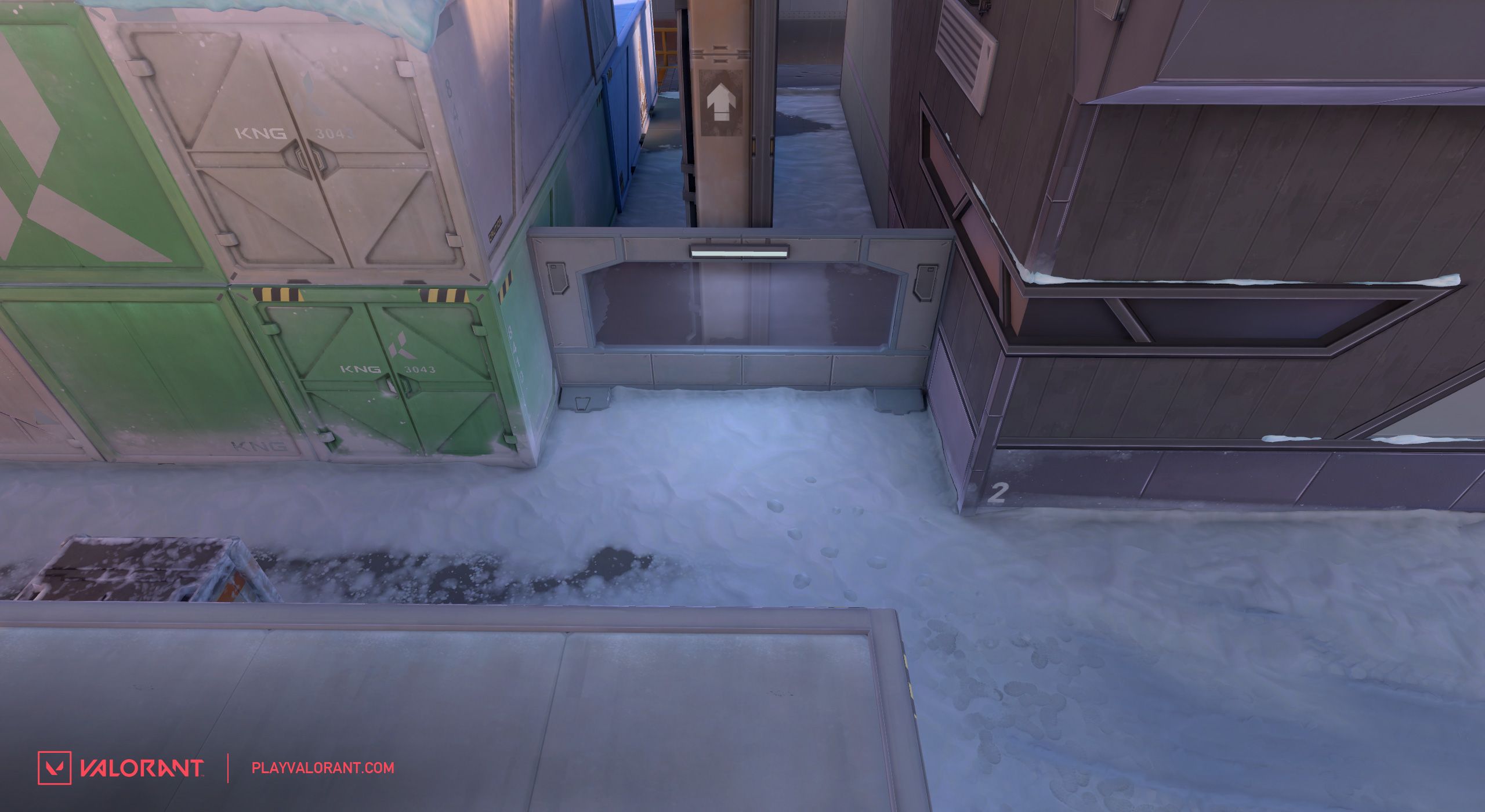
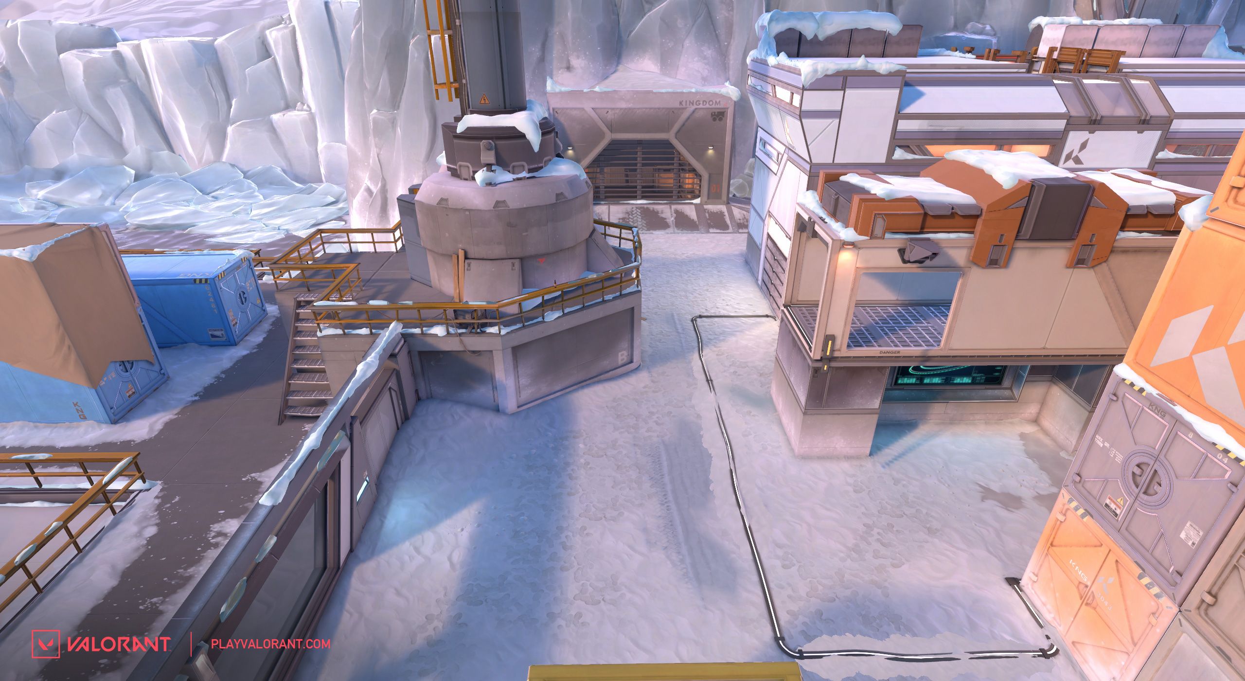
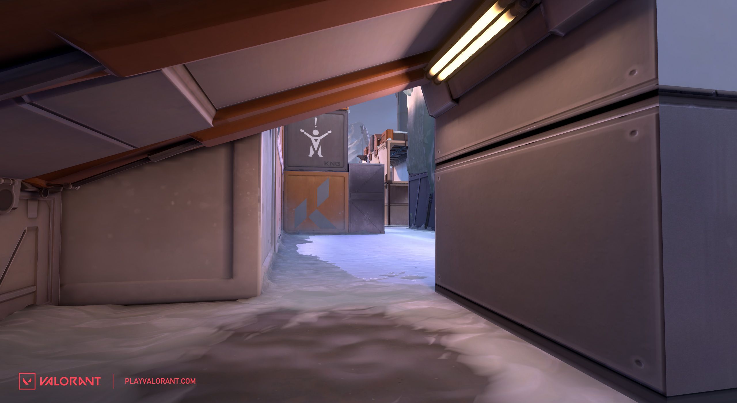
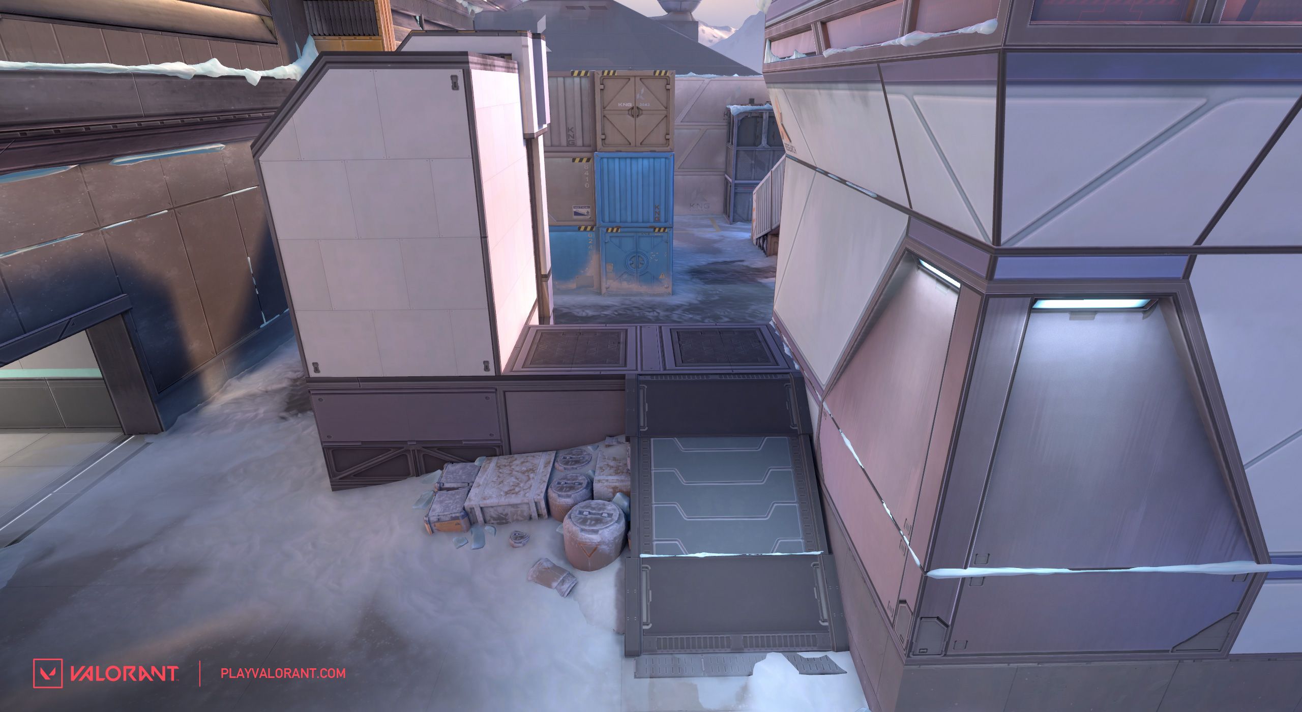
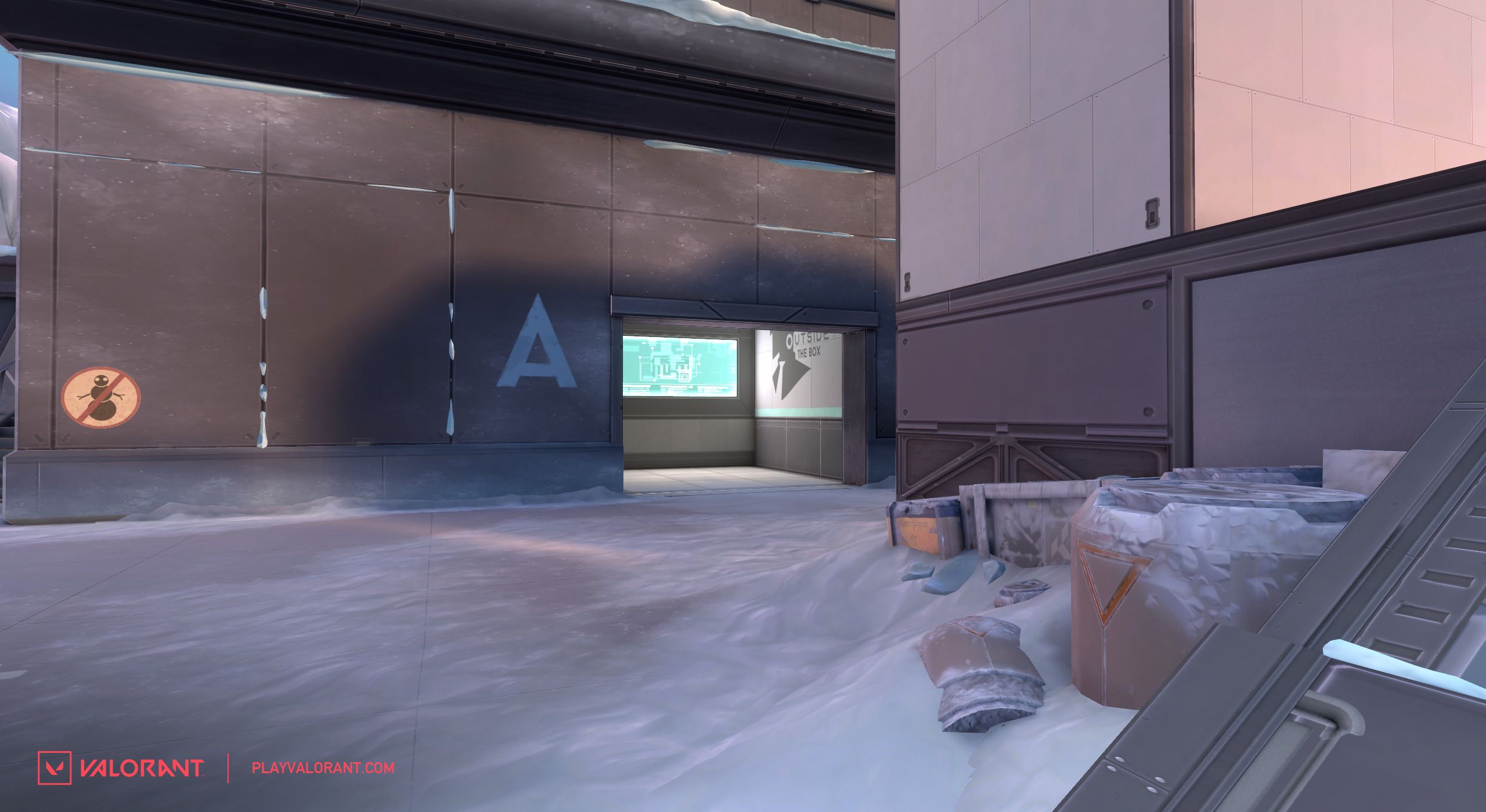
The building near the attacker spawn now has a different exit that now provides anyone pushing the site to clear out the area underneath the raised container. This should add more intention in how attackers initially decide to push into “Green” (the large green container area) and allow them to support each other more effectively.
Green lane itself is now less cramped, made slightly wider with the intent to loosen the area for a multi-Agent push. Lastly, the pocket near “Yellow” (the large yellow container) was also extended.
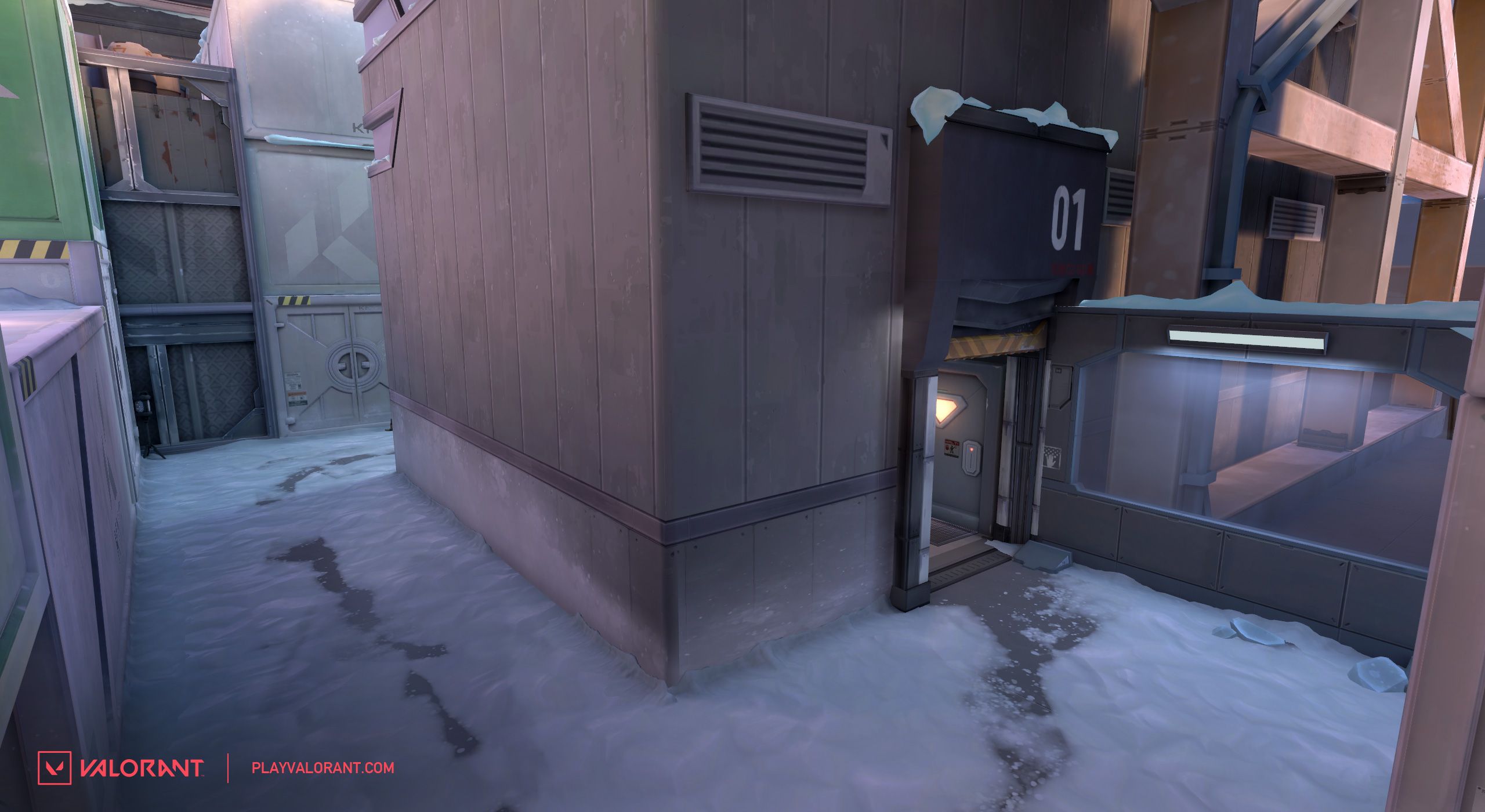
Now on to one of the hotter topics in this set of changes, Yellow!
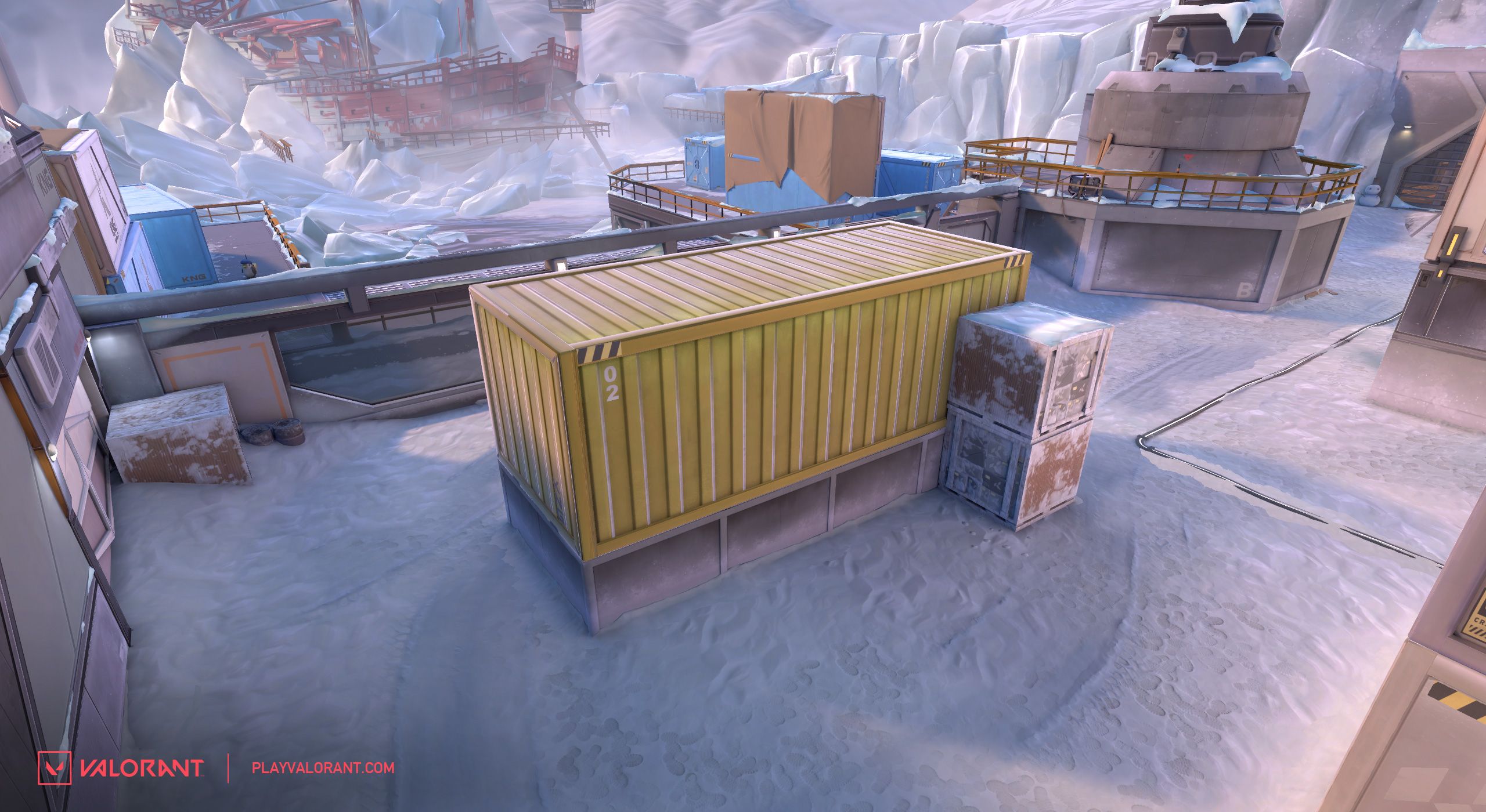
Something we observed on B site was attackers getting control of Yellow and then hunkering down there for the rest of the hold. It makes sense, Yellow provided a lot of powerful positioning and was difficult to flush out.
But we wanted to remove some of that power from Yellow while still making it somewhat effective to anchor behind. These changes make it so that players have to be a bit more committed with their positioning. It should also make Yellow easier to control or flush out with utility. This—along with changes to the site itself that we’ll get to next—should give attackers more reason to push up further into the site and control more space then before. Our thinking here is that promoting this type of action is healthy for gameplay on Icebox.
Cool, now onto B site itself!
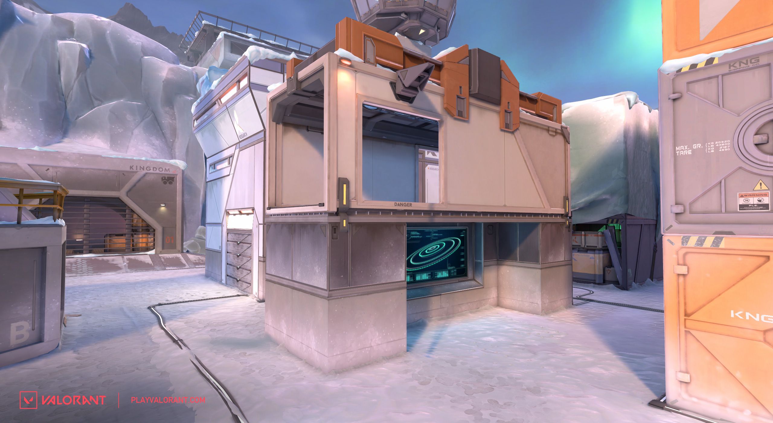
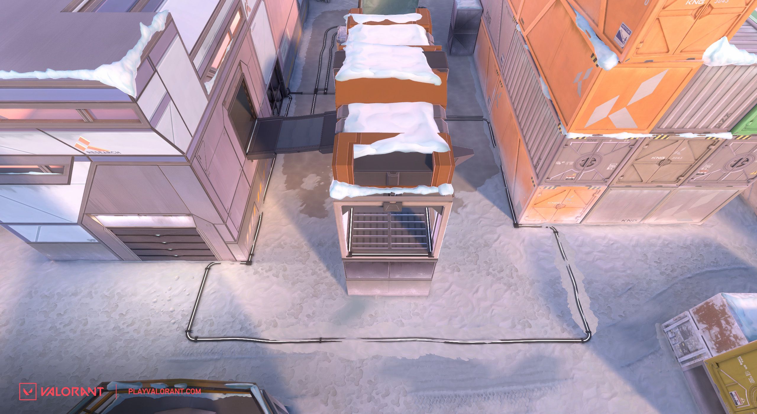
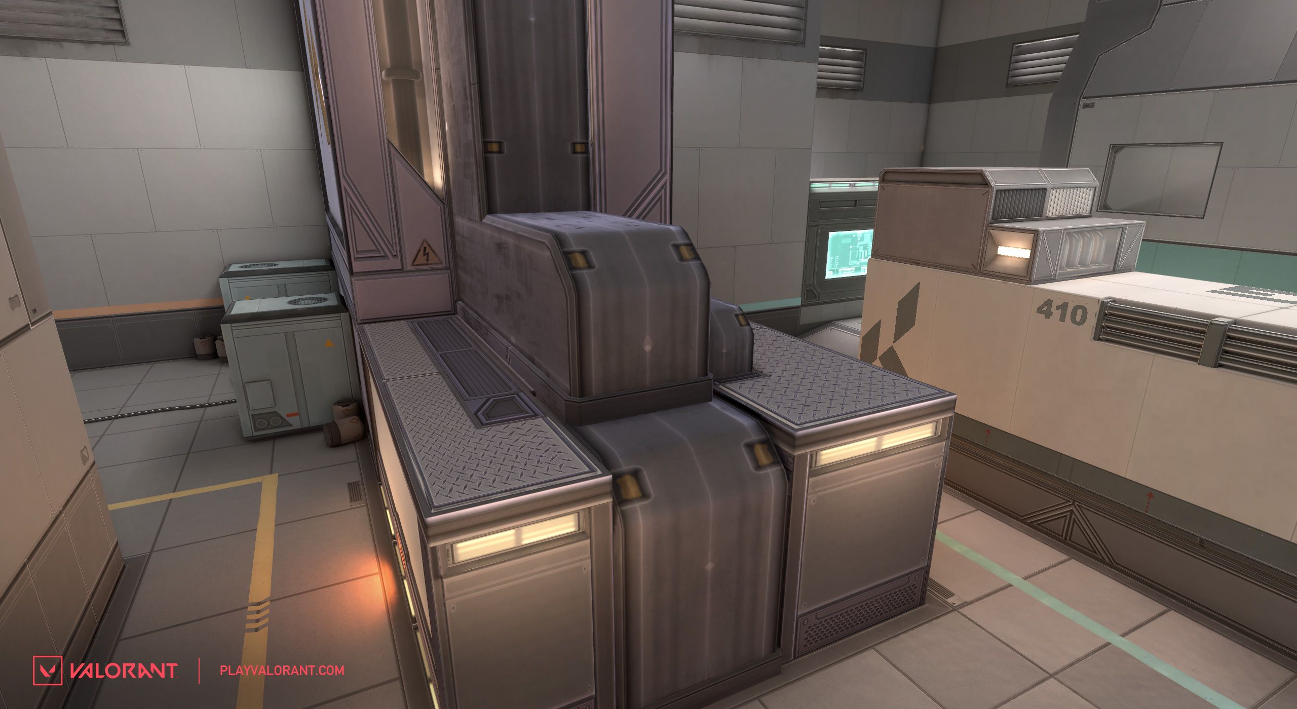
The lower container is now closed off. We noticed it was overly difficult to both clear the area with confidence and play on site due to some of the complexity in this space. The thin walls also led to less than ideal fights. The new geometry provides safer options to play from and should also be easier to mentally keep track of as the round unfolds. The doorway on the top container has also shifted over to provide better visibility to defenders and also covers attackers approaching from Green.
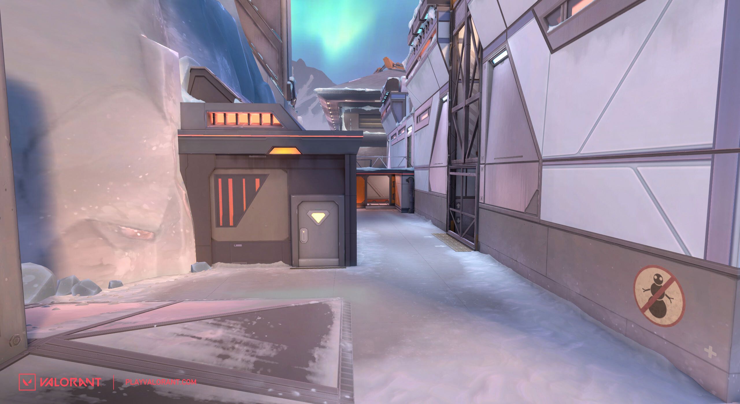
There is also the shift of the outer wall and crane structure. This pinches off the space leading to Snowman (top left corner on the minimap) enough for well-placed smokes to cover.
The old “default” boxes (area adjacent to the plant zone) have shifted closer to Mid. This change blocks off line of sight from “Danger” (the corner next to crane) to under the Mid tube. Without the Default boxes, some changes needed to be made to the Spike plant zone. The zone has now been extended toward Green, enough so that it should provide a relatively safe plant option—assuming the attacking team has control of B Site. The zone has also been extended toward Snowman and the bridge to the upper container is now plantable as a way to introduce new Spike planting options.
Finally, the building in B Back has been officially closed off. This is to allow a way for attackers to push deeper into the site and give an opportunity to control this space. We also hope this highlights more plays that can be made through Fence. We like Fence plays.
ICEBOX QUALITY OF LIFE
Okay! Phew, that wraps B Site. Let’s chat about some of the quality of life changes coming to Icebox that we hope you won’t overlook. We’ve simplified the ramp geo at Boiler and pinched the space enough so that you hit more consistent smoke coverage if that’s your plan. This should also simplify where to expect peeks, as well as make the space more intuitive for Controller Agents.
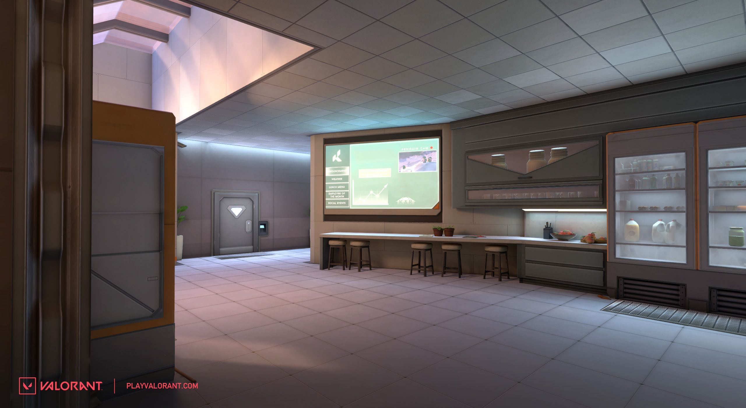
That Kingdom Kitchen has seen better days. But now the remodeled space boasts a brand new back wall!. This should allow players to move through this area with a bit more ease and feel less like a 50/50 when approaching from defender spawn.
It’s a minor detail, but the doorway into Screens has been lowered. Intent here is to eliminate the awkward “foot shoot” that existed there. Like footsies, but with bullets. Nobody liked that.
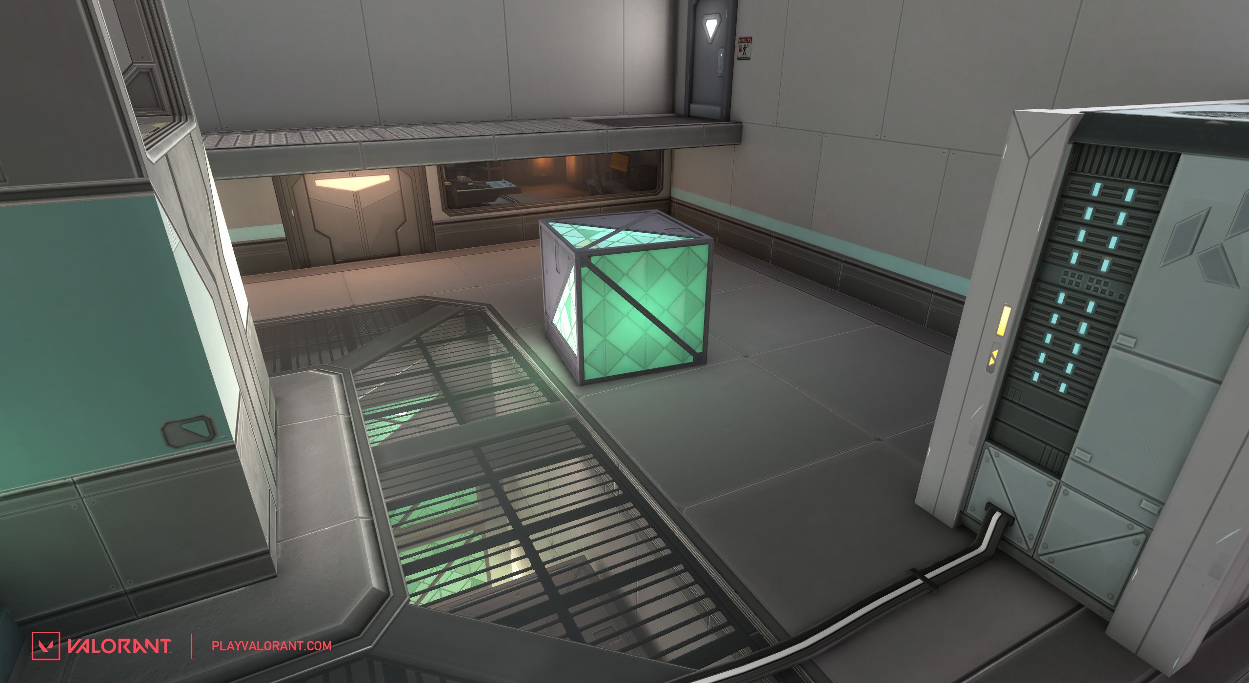
The half cover in A site has been swapped out for a crate. This is to give defenders a new position to hunker down on.
The head peek on attacker side pipes is gone. Attackers have a lot of options when approaching A site, so we thought we could simplify that.
GOOD BONES
Well, that was a lot! We hope these changes bring some new exciting play opportunities to B Site and that overall, the map feels more intuitive. RIP Hiko clutch spot, you will be missed but we look forward to all the sick new clutches the rest of you will make with these changes! As always, we would love to hear your feedback! All of you help us shape VALORANT into the best game it can be. Hit me up with your thoughts on these changes and anything map related!
Thanks for your time and see you on the Box.
