Preview the future of VALORANT’s interface
Our UX, UI, Engineering, and QA teams at VALORANT are excited to share some upcoming UX/UI visual changes that will start rolling out in Patch 5.08. These updates are focused on the out of game experience (outside of gameplay) and will bring a fresh sense of style while improving functionality in some areas.
The change means some previous functionality may be missing, but we’re still looking at your feedback as we roll out this update. Let’s break down why we’re working hard on a revamp, as well as our process and thinking around these updates.
WHY NOW?
The team isn’t updating for the sake of it. We are preparing for the future of VALORANT, including new features we can’t wait to talk about when the time is right. For now, we are excited to iterate towards a premium UX/UI front end experience that reflects the overall direction the game is heading. This includes reevaluating our UX/UI standards, assessing art fidelity, and introducing motion design to boost game flow and expression. Additionally, this revamp will better prepare us for a more consistent look and functionality as we work towards future platform experiences.
OUR PROCESS
To kick things off, we created a special task-force team to guide these efforts. This group’s goal was to identify how to converge efforts across UX, UI, Engineering, and QA to plus-up our game client and allow future scalability more easily. Some areas/tasks they tackled included:
- Auditing areas of opportunity in core game flow screens
- Defining where we can build consistency in design choices
- Building game engine enhancements
- Determined the backbone of our client and explored compatible multiplatform navigation options
- Broad style explorations at a high level to test our key assumptions
- Leveling up how we present VALORANT style and aesthetic in game
You’ve likely already noticed the start of this work in Patch 5.03. The Agent Browser UI was the first release of this greater effort. The team replaced our Agents’ textures with their 2D key art illustrations and updated the color schemes behind them to better convey their iconic and expressive personalities. This is just the start! We already have greater ambitions for this screen, along with many others.
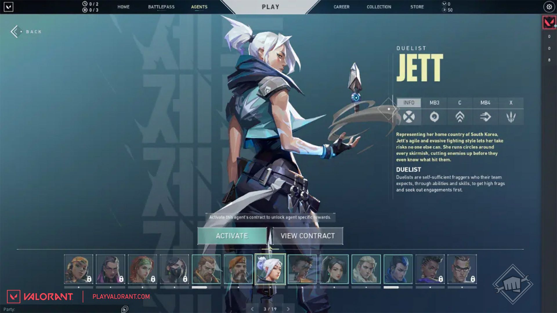
A SNEAK PEEK
With the goal of bringing together visually rich, vibrant, and fresh interfaces to unify our game and marketing visual identities, the first update we want to share is our new MVP screen.
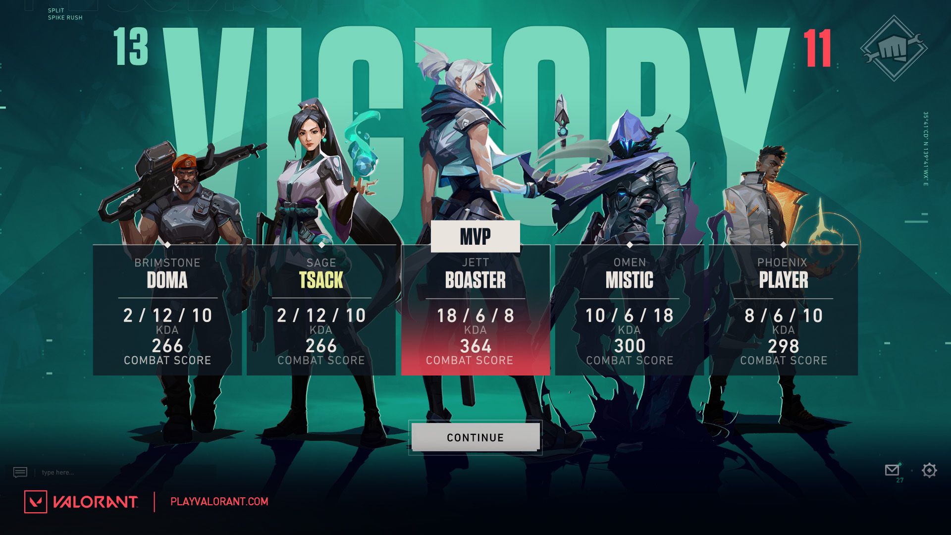
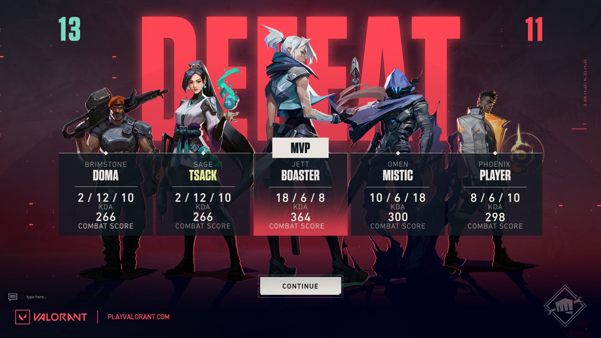
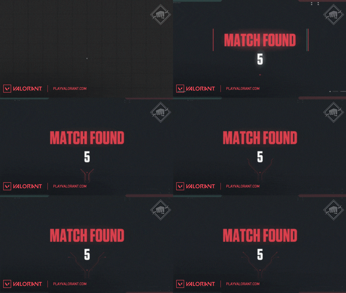
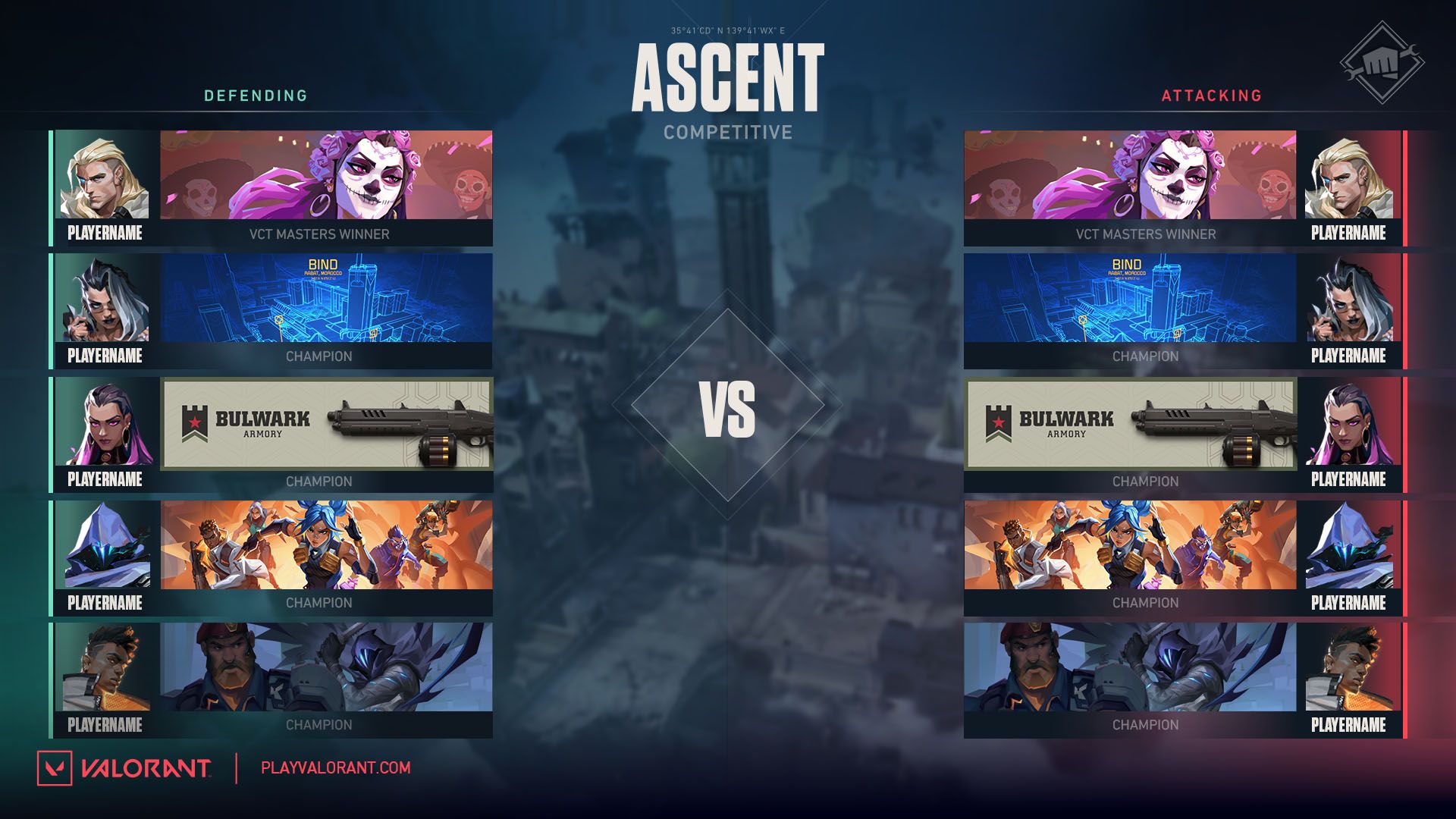
You’ll also start to see a new lobby, pre-match loading screen, and End of Game screens with designs meant to improve legibility.
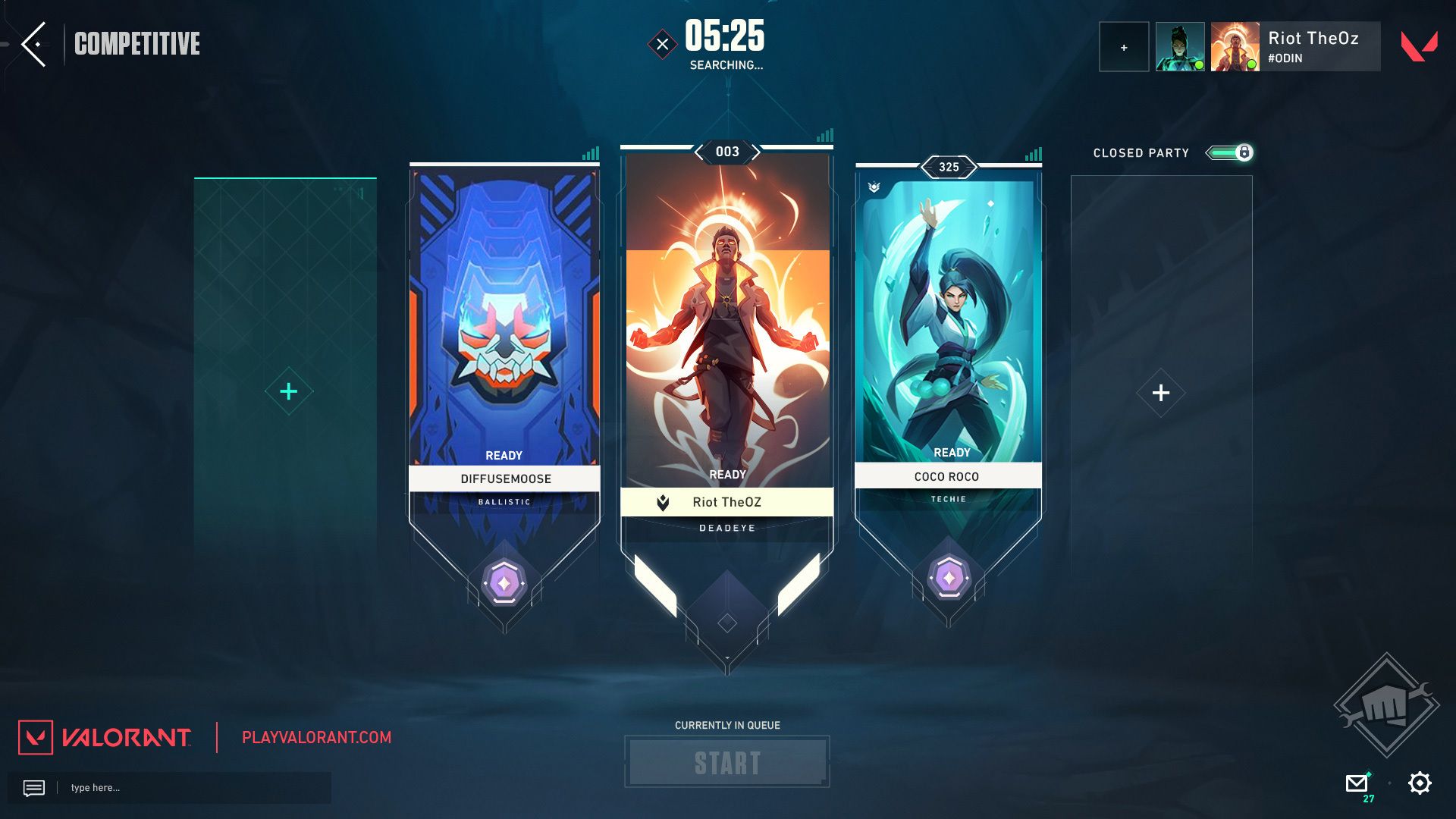
ON THE HORIZON
Like we said at the start, expect more updates and iterations that bring motion design and overarching visual polish throughout the game. Multiple VALORANT teams are in the process of redefining the user experience and visual fidelity of many features. Any and all new features hoping to ship this year will be developed under the new visual direction with room for additional enhancement.
Once you get your hands on this, we want to know if there’s functionality you’re missing so we can continue iterating and improving the UI. We look forward to sharing more!